Samples and Stats
There's some good stuff in this UXmatters article: User Research Doesn’t Prove Anything. The sections on sampling and statistics are very nice summaries for UX practitioners. I've met many UX practitioners who either:
- never learned these subjects in school
- forgot the relevant lessons
- think that you can gloss over these points in business
Being accurate is important. There is a difference between saying "78% of users think…" versus "78% of the research participants think…”. Yet, I've seen people who think that in order to write things understandably in "plain language", you need to sterilize the message of anything sounding statistical. They try to convey the "jist" of the statistics without sounding like a statistician.
Sloppy research, sloppy statistics and inaccurate wording of findings will lead to haphazard business decisions. It's not good enough that you get your client to make the "right" decision. "Professionals" shouldn't have the attitude that the "ends justify the means".
We have an ethical responsibility to our clients, and to our users, to report accurate statistics from our research. You don't have to kill your clients with stats...just be accurate with the stats you report.
We should help our clients understand our research, the data, and the statistics that are used in the analysis. Not only will they better appreciate the skills we bring to the table, but they will be smarter clients when confronted by other opinions or seemingly contradictory "research". In short, be accurate, and educate your clients rather than dumbing things down for them.
Additional resources
- UPA Code of Professional Conduct
- Measuring Usability
March 22, 2007
March 16, 2007
Web 2.0
If you haven't seen this video from YouTube entitled "Web 2.0...The Machine is Us/ing Us"...you should.
It's notable not just for the points the author is making, but for the really cool techniques used. The style is simple and great.
http://www.youtube.com/watch?v=6gmP4nk0EOE
Let me just add that...
We'll need to rethink usability.
Additional Resources:
- Wikipedia: Web 2.0
- AJAX Usability Metrics (PPT)

February 12, 2007
Your next "car"?
BodyRite: HyperBike.
I wonder if this contraption comes with drink holders or an mp3 player...
BodyRite: HyperBike.
I wonder if this contraption comes with drink holders or an mp3 player...
January 26, 2007
January 23, 2007
Joel's review of Dreaming in Code
Joel Spolsky's post The Big Picture has some great UI design points to make:
First, that you need to DESIGN first, and that many projects fail because people jump right into coding without a design:
"This is a particularly dangerous trap when it comes to software development. You get some big picture idea in your head for what you want to do, and it all seems so crystal clear that it doesn’t even seem like you need to design anything. You can just dive in and start implementing your vision."
Second, that a risk of abstract thinking (often done by architects) is that you can quickly leave real-world concepts, and users, behind.
"'No Silos' was supposed to mean that instead of having your email in one silo, and your calendar in another silo, and your reminder notes in a third, there would just be a single unified silo holding everything."
...I think the idea of “No Silos” is most appealing to architecture astronauts, the people who look at subclasses and see abstract base classes, and who love to move functionality from the subclass into the base class for no good reason other than architectural aesthetics. This is usually a terrible user interface design technique.
January 16, 2007
Stop, Look, Listen
In Berlin, a 46-year-old German motorist driving along a busy road suddenly veered to the left and ended up stuck on a railway track, because his satellite navigation system told him to.
When the friendly voice from his satnav told him to turn left, he did what he was 'ordered' to do and turned his Audi left up over the curb and onto the track of a local streetcar line.
Evidently, several German motorists have crashed their cars in recent months, later telling police they were only obeying orders from their satnavs.
Personally, I think we should use a warning label to solve this design problem. The label should say "Warning: This driver is too stupid to use all their five senses while using the on-board satnav system. Approach with Caution!'
Okay, so there's maybe a real usability issue here, but if the driver is dumb enough to not see the curb and the train tracks, what other mistakes are they likely to make at an intersection in traffic?
I can't help but think they should go back to basic drivers' training school and learn what they should do to avoid a crash with a train.
December 12, 2006
15 Ways You Should NOT Have Fun with Your Wii
Some entertaining graphics to decode:
Gizmodo: The Japanese Wii Safety Manual is Crazy
Thanks Paul
Some entertaining graphics to decode:
Gizmodo: The Japanese Wii Safety Manual is Crazy
Thanks Paul
November 27, 2006
Spamarama 2006: Are you attending?
According to a Postini press release, spam has skyrocketted 59% from September to November, and 91% of all email is now spam.
According to Postini's stats page, 10 out of 11 email messages are spam, and 1 out of every 184 messages is infected with a virus.
I personally have seen a huge increase in the amount of spam I'm receiving. How about you? Leave me a comment and tell me what your inbox is experiencing lately.
According to a Postini press release, spam has skyrocketted 59% from September to November, and 91% of all email is now spam.
"Postini processed nearly 70 billion email connections from September to November, and saw a 59 percent spike in spam over that period. Unwanted email is currently 91 percent of all email, and over the past 12 months the daily volume of spam rose by 120 percent. Postini also saw a dramatic increase in overall email traffic with 10 billion more connections in October than in September."
According to Postini's stats page, 10 out of 11 email messages are spam, and 1 out of every 184 messages is infected with a virus.
I personally have seen a huge increase in the amount of spam I'm receiving. How about you? Leave me a comment and tell me what your inbox is experiencing lately.
November 15, 2006
Nice Information Visualization Blog
Junk Charts is a neat blog that critiques charts, and then goes futher in some cases into redesigning them. If you enjoy Edward Tufte's work, you'll like this.
Thanks to Peter B.
Junk Charts is a neat blog that critiques charts, and then goes futher in some cases into redesigning them. If you enjoy Edward Tufte's work, you'll like this.
Thanks to Peter B.
November 09, 2006
Bad Usability Calendar
Thanks to the latest UPA Monthly (a UPA member newsletter), I learned of this frabjous "Bad Usability Calendar" for 2006 (PDF). It's great...er...really bad...well, you'll know when you see it.
[Note: After blogging this it strikes me that it's totally in the spirit of this calendar to wait until November to tell you about it. :-) ]
October 30, 2006
Cryptography experts confess
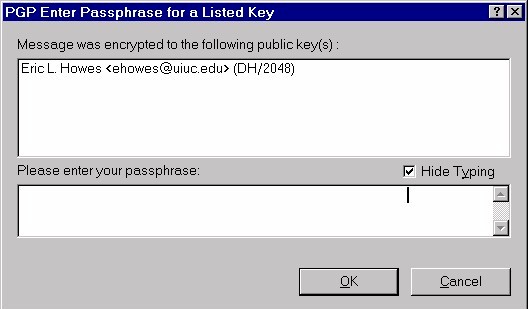
CNET: At 30, crypto still lacks usability, experts say
" 'In the early years, we as an industry could blame the system for controlling the pace of innovation because the government was throwing up roadblocks,' Ozzie said. 'At this moment in time, it's laziness on the part of the industry in terms of not embracing architecture and the importance of human interface in design of secure systems.' "
I wonder what their plan is to address the issue...
To read the rest of this article enter the passphrase for your private key corresponding to the public key that was used to encrypt it. :-)
(See: PGP Tour: PGPmail for great examples and screen shots!)
September 26, 2006
New Podcast Installment: SpoolCast #2
As you may have noted in an earlier post, I'm part of a panel podcast that is geared toward user experience practitioners...called the "Spoolcast". The latest installment (#2) is just coming out now, and I must say I think it'll be enjoyable and thought-provoking for those in the "user experience biz". We engage in some light-hearted joking and debate, while actually talking about some serious UX and usability topics.
About Spoolcast #2:
Recorded September 11, 2006, we discuss dream panels, CUE studies, whether we’re an engineering discipline or a craft, the value of heuristic evaluations, and whether we should learn anything from Facebook’s recent loss of face.
(Note, each session is being released in four parts. Parts 1 and 2 of session #2 are online already...more to follow.)
Make a comment here or send me email to let me know what you think of the latest podcast installment.
Related Posts:
Hear the Croc Speak...Froggy Style in Podcastese
September 21, 2006
Reach Out and Observe Someone
Just found this small Remote Usability Testing Wiki - which has a couple of nice lists of remote testing tools and remote card sorting tools.
It also alerted me to a new tool from TechSmith - UserVue...which complements Morae very nicely!
[Thanks to Nate Bolt]
Just found this small Remote Usability Testing Wiki - which has a couple of nice lists of remote testing tools and remote card sorting tools.
It also alerted me to a new tool from TechSmith - UserVue...which complements Morae very nicely!
[Thanks to Nate Bolt]
September 17, 2006
User Friendly Conference 2006 - Hangzhou, China
Nov 3-5, 2006
UPA China warmly invites you to User Friendly 2006 for 3 days, bringing together usability practitioners, designers and technologists from across China and internationally. Come to Hangzhou to continue the tradition of sharing, friendship and learning as experienced in Beijing (2004) and Shanghai (2005)
The conference will be in English with Chinese translation.
The program includes tutorials, plenary sessions and round-tables, as well as plenty of time to network and socialize. Speakers include: Bob Barlow-Busch (Quarry), Annie Chang (Microsoft), Apala Lahiri Chavan (HFI), Giles Colborne (CX Partners), Jian-Ming Dong (Paypal), Gerry Gaffney (I&D), So-Young Kim (DNA), Kun-Pyo Lee (KAIST), Whitney Quesenbery (WQusability), Daniel Rosenberg (SAP), Paul Sherman (Sage), Daniel Szuc (Apogee), and Yu Guo (Baidu).
[Thanks to Dano]
September 07, 2006
Card Sorting from the Bottom Up (and the Top Down)
If you're in the Twin Cities area of Minnesota, check out this UPA Minnesota Chapter event on Card Sorting on September 14th.
If you're in the Twin Cities area of Minnesota, check out this UPA Minnesota Chapter event on Card Sorting on September 14th.
September 05, 2006
Hear the Croc Speak...Froggy Style in Podcastese
I recently participated in a new panel podcast with a great group of folks put together by Jared Spool. The sessions have been coined "Spoolcasts", and I think the first one turned out pretty good.
During the first podcast, we talked about the new Brown University web site, what it means to be usable, MySpace, Craigslist, the importance of home page design (Jared thinks home pages are the least important page on a site...everyone else agrees that he's out of his mind), the UPA Body of Knowledge project, and conferences.
I should add that my voice was not (and still isn't) "normal" for the recording session. I had severe laryngitis for over three weeks and somehow my voice recovered enough that I could participate that day. It's still not 100%, but hopefully on the mend. So, as you listen to the podcast, keep in mind that the voice you're hearing is a bit more "froggy" sounding than my normal voice. I also had to pause a bit more between words to keep my vocal chords from cracking up.
(The real trick has been trying to be a consultant all day...talking on the phone, giving presentations, and leading a project team...with no voice to speak of...or with. A day or two was no problem...after that it got pretty stressful. Thankfully, it seems like it's on the upswing now.)
Oh, the podcast is also available on iTunes under UIE Brain Sparks or the RSS feed is available at http://www.uie.com/podcast.
A few quotes from the first podcast:
- "You know the VP-based navigation scheme has not left us yet." - Me
- "We tell clients that their home page is the least important page on their site." - Jared
- "It's funny that a university site would be too academic." - Me
- "Trying to do charades through the Internet is really hard." - Jared
- "If you're going to see “Snake on a Plane”, seeing it with 25 sixteen year olds is probably the best way to see it." - Jared
- "I was just thinking it’s lucky their name is not Chartreuse University." - Me
For those of you not familiar with podcasts yet, think of them as being similar to college radio shows...without the college or the radio.
August 29, 2006
UPA 2007 Conference Submissions Open
Have you considered creating a submission for the Usability Professionals'
Association (UPA) Conference next June 11-15, in Austin, Texas? This is
an excellent opportunity for you to share your knowledge and experience
with other's who care about usability!
http://www.upa2007.org
Have you considered creating a submission for the Usability Professionals'
Association (UPA) Conference next June 11-15, in Austin, Texas? This is
an excellent opportunity for you to share your knowledge and experience
with other's who care about usability!
http://www.upa2007.org
August 28, 2006
The Truth of User Experience: Three Stages
"All truth passes through three stages. First, it is ridiculed. Second, it is violently opposed. Third, it is accepted as being self-evident."
- Arthur Schopenhauer
This quote made me think about how usability (the concept) has been received by the technology elite in the last 10 years.
First, they seemed to reject it...refusing it flat out. Much like strung-out groupies who'd been riding the tour bus and partying backstage far too long with their rock and roll "gods" in the mythical band called "New Tech and The Latest Gizmos." They ridiculed those in the usability movement as if they were "New Kids on the Block" and promised that in time people would see that "New Tech" was where it's at.
Second, they opposed the messengers. The way to be cool was to take shots at Jakob Nielsen and other usability proponents. I seem to recall that Jakob's hair, website, sideburns, guidelines, thumbs and speaking style were favorite targets.
Third, they started accepting it (or the need for it) as self-evident. This doesn't mean they understand how to create usable products, but it's definitely not unusual for business people to have discussions about usability these days. In addition, lots of companies are trying to hire usability talent: Monster.com lists over 1000 usability jobs, and CareerBuilder has 979. Design firms have all seemingly retooled...suddenly splashing a "user experience" coat of paint on their existing wares, no doubt in response to customer demand.
So now we've entered a phase where buyers are seeking "the truth"...with a lot of false prophets and snake-oil vendors selling cheap wares. Buyers aren't educated enough yet to know what to look for...but that's changing.
Consumers and markets have evolved to the point that usability will continue to be a huge factor in coming years. Just look at food for example: we no longer think much about food safety, about freshness or transportation, or about variety. Supermarkets in developed countries offer a huge variety of safe foods from all around the world. Food companies have started focusing on consumer convenience: packaging, portability and portion size for example. Convenience...analogous to "ease of use."
What do you think? Am I speaking the "truth" or telling a whopper? Leave me a comment and let me know.
Additional Resources:
- The Backlash against Jakob Nielsen and What it Teaches Us
- Usability Jobs: Usability Professionals' Association
- Directory of Usability Consultants: Usability Professionals' Association
August 25, 2006
Ease of Use and Usability Engineering as Marketing Tools
This press release from Red Gate shows how you can use ease of use as a competitive advantage:
Red Gate Poll Reveals Role Of Usability Engineers Critical To Future Of Software Development
A few nice quotes from Red Gate's Press Release:
"The company’s SQL Bundle customers were asked why they would recommend Red Gate products, with an expectation that the majority would choose one of the first three options: time-saving, speed, or accuracy. Instead a conclusive 65% chose the fourth option – ease of use."
"Unfortunately, the marketplace for packaged software solutions is cluttered with vendors trying to sell Swiss Army knives when most buyers are looking for a hammer, but good usability engineers will allow better products to be produced without hindering quality. We will continue to strive for better testing, as we always do, but will be taking on more Usability Engineers to improve user friendliness even further,” added Reed."
"The discipline of usability engineering has been an object of study and learning ever since computer technology emerged as a viable industry. Developers, testers and users are now recognising the increasing importance of usability as a significant driver of developing good software tools and customer satisfaction rates."
Check out their web site for screen shots of their software (in walk-throughs). I see evidence of good UI design:
http://www.red-gate.com/products/SQL_Compare/
August 08, 2006
Oz -IA 2006
An IA conference in Sydney, Australia looks to have a great lineup of presenters. I've met a few of the presenters, and just wish I didn't have all this "real work" to do, and could just attend conferences around the world for a living. (Anyone who'd like to gainfully employ me to attend conferences on their behalf, please email me at yesimfilthyrich@professionalconferenceattendees.com.)
Thomas Vander Wal, Dan Saffer, Donna Maurer, Eric Scheid, and Ash Donaldson are all folks I wouldn't mind seeing present. I just met Ash at the UPA 2006 conference in June - great guy. I recall we had a nifty discussion about Activity Theory over drinks one evening.
I also think the navigation on the Oz-IA site is neat. It's humorous and ironic that IA's would design and use an image of a Post-It note/whiteboard site map diagram for main navigation...it made me chuckle. (The site's small enough that this design works just fine and conveys a certain "IA-ishness" to users.) It's very creative...I like it.
June 12, 2006
More Blogs About UPA 2006
I've updated the UPA Conference Wiki to include a list of bloggers who've posted something (so far) about the UPA 2006 conference. To login to the UPA Conference Wiki, use a password of "upa".
I've updated the UPA Conference Wiki to include a list of bloggers who've posted something (so far) about the UPA 2006 conference. To login to the UPA Conference Wiki, use a password of "upa".
UPA 2006 Conference - Monday
This week I'm at the Usability Professionals' Association (UPA) Conference, just outside of Denver, Colorado. It's only Monday, and I'm already meeting new people and learning new things. The number of people trying to make more usable products around the world is really amazing. There's a great amount of international attendees. Last night I had dinner with 3 other people from the U.S., 2 from the UK, 2 from Hong Kong, and one from New Zealand. I guess it's not really surprising since UPA now actually has more chapters outside of the U.S. than within the U.S., but it's definitely exciting to find that such a diverse group shares the common language of "usability."
Here are some UPA 2006 photos from Daniel Szuc of Apogee Usability Asia (in Hong Kong). Hopefully other attendees will add to the set as the conference proceeds.
May 02, 2006
Card Sorting - The Book
A book in progress by Donna Maurer. Publisher: Rosenfeld Media. Anticipated publication date: January, 2007
Donna has been writing her weblog, DonnaM, since 2002, and is a Very Sharp Cookie. Donna says that many of the existing resources on card sorting don't answer the majority of questions practitioners face, so she's focusing on card sorting as a practical technique to be used in the design of information environments. As a practitioner who's had to learn most of what I know about card sorting by doing it, I love the focus she's got for this book, and I know Donna can pull it off.
If you have experience running card sorts, you might consider helping Donna by completing a survey on card sorting that she's running.
Donna has written a number of articles for Boxes and Arrows, including a "definitive guide on Card sorting".
Donna is also an active member of the Usability Professionals' Association (UPA), is a local ambassador for UXnet (the User Experience Network), and is very active in the IA Institute.
More Info: Rosenfeld Media - Card Sorting Book
Additional Card Sorting Resources:
- STC's Card Sorting Resource List
- Card Sorting at IAwiki
- Card sorting at iaslash
May 01, 2006
Online Photo Editor - A Lightweight PhotoShop Anywhere?
A new web application called Phixr (pronounced "fixer") is pretty slick. After playing with the online demo a bit, I'm impressed. You can do basic photo editing:
- resizing
- cropping
- red-eye removal
- rotating
- sharpening / blurring
- adding borders
- adding text
- and a number of other functions
What's impressive is it looks like the designers boiled photo editing down to the key 20% of functionality people need 80% of the time. The result is a nice, lightweight web app that does what many people need to do. It's also (for a photo editor) a pretty simple user interface - with nice previews of changes before they are executed, as well as undo and redo functions.
There are a number of improvements that can be made to the app, but it's still noteworthy as a rather simple photo editor, that's free, and requires no software installation.
Try out Phixr
April 28, 2006
Human Error, Design Flaw, or a Darwin Award Winner?
When you see a headline like "Man runs himself over in Burger King drive thru" - you just have to watch the video.
Related:
- Darwin Awards
- How To Jump Start A Car (Note it says to "make sure the cars are in park", but it omits the very important precautionary warning "don't lay underneath the car while performing the jump start.")
January 31, 2006
Caroline's Rules for labelling Buttons
1. Label the button with what it does.
2. If the user doesn't want to do it, don't have a button for it.
Read Caroline's nice, short article on the topic:
http://www.usabilitynews.com/news/article2949.asp
Related Info:
- MS Windows Interface Components - Controls - has a section on command buttons
- Apple Human Interface Guidelines > Controls > Buttons
- IBM: Using Web widgets wisely, Part 1 - Has a short section on command buttons
- Alertbox: Reset and Cancel Buttons - covers issues around using the dreaded reset button on web forms
- The Piece of HTML created just for Me: Reset - Caroline's explanation of why you should scrap your reset button.
- Usability.gov Research-Based Guidelines > Screen Based Controls (PDF) - discusses "PushButtons"
New Year, New Job, New Posts
Wow! It's been two months since my last post...I can't believe it. Well, I'm planning to change that and post more frequently. (Publicly declaring that means I'm all the more likely to actually do it.)
I recently took a new job...leaving my position as User Experience Director at Cargill. Cargill's a great place to work, and I really enjoyed the time there and will really miss the people I worked with there. Perhaps more on the new job later.
November 26, 2005
Workers Waste 10% of Their Time Fighting with Technology
From Scotsman.com: We have the technology, now tell us how to use it
"OFFICE workers waste up to a month a year trying to figure out how to use their computers properly because modern technology is so complicated, a new study warns.
Trying to get their heads round difficult programmes on the PC is costing firms both time and money, often because no-one has taught employees what to do."
"The survey of 500 workers and 300 bosses by the training body City & Guilds found that workers spent 10 per cent of their time battling against computer programmes or getting to grips with phones, handheld devices and other gadgets, equating to a month a year.
Thirty-seven per cent say they are frustrated by not being able to handle the technology.
About a third (32 per cent) of workers say they have failed to receive training from their company to teach them to use the technology in the office."
November 03, 2005
Today is World Usability Day
I'll be participating in events here in the Twin Cities along with representatives from many local companies.
"On November 3rd, 2005, World Usability Day, a worldwide series of events will promote the benefits of user-centered design, with the theme "Making It Easy." Local events are being held in over 100 locations in 35 different countries."
World Usability Day is getting quite a lot of attention from major media and press (and this is just the first one). For example, a Usability Professionals' Association spokesperson will be on CNN Headline News at 7:15 (Eastern time?) in the morning to talk about the event. Other representatives have been interviewed for radio and various publications. Here are links to a few early articles talking about the Day along with usability, and user-centered design:
USA TODAY: Why are tech gizmos so hard to figure out?
http://www.usatoday.com/tech/products/2005-11-01-usability-cover_x.htm
St. Louis Post-Dispatch: “World Usability Day” aims to make technology
more user-friendly
http://www.stltoday.com/stltoday/business/columnists.nsf/techtalk/story/2A55335C4AB1E067862570A7006AFC1A?OpenDocument
Sydney Morning Herald: Pushing the right buttons requires a human touch
http://www.smh.com.au/news/technology/pushing-the-right-buttons-requires-a-human-touch/2005/10/31/1130720481954.html
(Talks about how even urinals have been improved using UCD.)
BBC: The secret of making things work
http://news.bbc.co.uk/1/hi/magazine/4393468.stm
October 27, 2005
User Centered Products Are Market Winners - An example from Whirlpool
This recent Whirlpool Press Release is just one example of how a company that adopts and uses UCD (I know that Whirlpool has an active UCD/usability team) will create products that win in the marketplace. The press release shows that, by being user-centered, a company knows what product features or attributes have value to different audiences. Often these value points are learned when evaluating designs (e.g. in usability tests).
Here's an excerpt (note that Duet is a high-end model of Whirlpool front-loading washer and dryer):
"[T]he attribute that stands out most prominently with consumers may be the overall design of front loaders, and most prominently the features of the Duet(R). At the time it was introduced it was hailed for its sleek, sophisticated, user-friendly design, garnering praise from an impressive and diverse range of audiences, including the National Federation of the Blind (NFB), whose members appreciate the Duet(R) model's tactile and audible controls.
"We often find that technologically advanced products are difficult for blind people to use, because they often incorporate things like touch screens and LCD displays that require sight," said Betsy Zaboroski, executive director of NFB's Jernigan Institute. "With the Duet, you get the best of both worlds -- it's high tech, but usable by virtually everybody. That's great design."
Other accolades for the Whirlpool Duet(R) fabric care system include:
- The editors of Popular Mechanics, Graphic Design USA Magazine, and Appliance Manufacturer Magazine for design and/or engineering achievement.
- ID Magazine (International Design), one of the design industry's most respected publications, honored the Duet(R) system in its Consumer Products category
- A Human Factors & Ergonomic Society User-Centered Design Award because the pedestal drawers raise the unit off the floor by 13 inches, minimizing bending while providing additional shelf space."
Of course Whirlpool doesn't talk as much about it's usability team as we'd like. Why would you reveal a competitive advantage? But they have had some press. This article says that "Whirlpool assembled a global design team of industrial designers, human factors, and usability specialists from around the world, including Germany, Italy, Great Britain and the United States" to create the Duet line and that it "has been a consumer hit ever since. 'It’s been so successful that we’ve been playing catch up with production capacity,' says Joe Foster, director of Whirlpool Brand Fabric Care. 'We’ve had to invest in additional production capacity twice since the launching in 2001 to keep up with consumer demand.' [Date of article publication unknown.]
FastCompany published an article on Whirlpool's design innovation in June 2005. It's a great read and offers the savvy reader glimpses of usability testing at Whirlpool - in the first paragraph:
"Whirlpool design chief Chuck Jones stands behind a two-way mirror in a dimly lit observation room at the company's headquarters in Benton Harbor, Michigan. On the other side of the glass are a twentysomething volunteer and a shiny, black refrigerator. Jones and a small team of designers, engineers, and usability specialists watch as the woman loads groceries into the fridge. Her movements are mind-numbingly mundane, but the Whirlpool folks are rapt. "This is a very complex interaction between a user, a product, and her goals," whispers a human-factors expert."
The article goes on to say "At $2,000, the Duet is Whirlpool's most expensive washer-dryer set, yet it sells like an iPod: In the premium front-loading washer category, Whirlpool has gone from a market share of zero to more than 20% in three years."
Those that wonder about the return on investment (ROI) of User Centered Design (UCD) and usability should take note. Of course, I'll take market-disrupting innovative design over generic ROI any day. :-)
See also:
* New Generation of Innovators: Creating Extraordinary Products which talks about the design team at Whirlpool
* Whirlpool Finds Its Cool - To understand what good design can do for the bottom line, check out how Chuck Jones has revved up the sleepy, boring world of refrigerators and washers.
* Whirlpool Relies on Networking to Harmonize its Global Operations
* 2004 World Technology Awards Winners & Finalists - Charles Jones -- a biography of Whirlpool's design chief
October 25, 2005
ROKR Phone Not Meeting Customer Expecations
ROKR Not Rocking, says Motorola
"Motorola's chief executive - Ed Zander has reportedly admitted that the company may have got it wrong with the recently released, iTunes-compatible, ROKR phone.
...the number of people returning the ROKR is six times higher than normal"
Seems to me that some early concept testing would have helped prevent some of this.
September 07, 2005
Now I've seen it all...
Talk about taking "user experience" to a whole new place:
http://restroomratings.com/
Talk about taking "user experience" to a whole new place:
http://restroomratings.com/
September 01, 2005
Letter to Google - How you can help Hurricane Katrina survivors
I just emailed this to the Google Blog:
Just an idea I thought Google could help with.
Currently the Google home page has a link to Google News coverage of Hurricaine Katrina. Something that might help survivors and family members is to have a link to a site or sites with information about finding/notifying family members who have survived. Another idea is to link to a Google map of the area affected. Links to charitable organizations would be great too, but a basic web search turns those up quickly enough.
With thousands feared dead, a huge effort will be spent trying to locate familiy and friends in the area who have been displaced or injured. Traditional communications are majorly crippled, and people aren't in the locations where they can normally be reached. Online locations and addresses are more persistent for people the "real" ones. Google is as close to an Internet home page or "town square" as it gets, so you would be able to help a lot.
Please pass it on to those who might be able to help within the Googleplex!
More Information:
- Wikipedia Hurricane Katrina - Excellent information so far, and improving constantly!
- WDSU - New Orleans
- WDSU Page for Messages From Katrina Survivors - helps people let others know they are safe or try to find missing people
August 31, 2005
Muji - the Un-brand
BusinessWeek: The Serious Cachet of "Secret Brands"
"Muji certainly has made a business case for saving marketing dollars on brand building and plowing that money into better design at affordable prices. Its executives believe a brand name or a logo is extraneous and doesn't bring a specific benefit to consumers except to satisfy their ego. "Muji can focus on the basic essence of products instead of dedicating energies to the frills," says Hiroyoshi Azami, General Manager at Japan's Ryohin Keikaku, which owns the Muji stores."
[Via Web Globalization News]
July 25, 2005
Polishing your diamond search results
Amazon's AJAX diamond search is very cool. It's also dangerous...if you say "hey honey, come check THIS out"...it could set you back thousands of dollars! :-)
Compare it to their basic diamond search [Suffers from linkrot - as of 2008, can select "basic diamond search" from the AJAX page, but not sure if this is what the old one looked like.]
[via iaslash ]
Note: Ajax link fixed April, 2008
July 15, 2005
Change or Die
"What if you were given that choice? For real. ... You wouldn't change." Nine in ten people wouldn't change.
"You can train a rat to have a new skill. The rat solves a puzzle, and you give it a food reward. After 100 times, the rat can solve the puzzle flawlessly. After 200 times, it can remember how to solve it for nearly its lifetime. The rat has developed a habit. It can perform the task automatically because its brain has changed. Similarly, a person has thousands of habits -- such as how to use a pen -- that drive lasting changes in the brain. For highly trained specialists, such as professional musicians, the changes actually show up on MRI scans. Flute players, for instance, have especially large representations in their brains in the areas that control the fingers, tongue, and lips, Merzenich says. 'They've distorted their brains.'
"Businesspeople, like flutists, are highly trained specialists, and they've distorted their brains, too. An older executive 'has powers that a young person walking in the door doesn't have,' says Merzenich. He has lots of specialized skills and abilities. A specialist is a hard thing to create, and is valuable for a corporation, obviously, but specialization also instills an inherent 'rigidity.' The cumulative weight of experience makes it harder to change."
"What happens if you don't work at mental rejuvenation? Merzenich says that people who live to 85 have a 50-50 chance of being senile. While the issue for heart patients is "change or die," the issue for everyone is "change or lose your mind." Mastering the ability to change isn't just a crucial strategy for business. It's a necessity for health. And it's possibly the one thing that's most worth learning."
Read the whole article in Fast Company: Change or Die
[Via Laurie]
July 12, 2005
Usability Professionals Salary & Employment Survey
As President of a local Usability Professionals' Association Chapter, one of the topics I get asked about most often is salary benchmarking. Sometimes HR professionals have a hard time getting data about compensation for Usability related jobs. Well, UPA is doing something that will help answer those questions.
The UPA is running a survey to gather information on usability professionals, including employment/salary information. This survey is open to all who work in the field, whether a UPA member or not.
If any portion of your job relates to usability, please consider taking the survey. This might include many different kinds of positions like Usability practitioners, Interface Designers, Information Architects, Technical Writers, Business Analysts, Technical Analysts, Graphic Designers, Programmers, Trainers, Managers, and others.
Please take a minute to fill out the short survey online at http://www.surveymonkey.com/s.asp?u=24248929450. It only takes about five minutes.
UPA is hoping to get enough entries - from both inside and outside of the U.S. - to report on employment conditions and practices confidently.
The results will be published in the UPA Voice.
Related Sites:
- UPA Job Postings
- Usability related jobs list - DFW UPA Chapter
- User Experience Job Titles and Their Meanings
Is PC Support fundamentally broken?
A thought-provoking quote from PC World's Techlog - Dell vs. the Blogosphere
"When my electricity goes fritz at home, I call in the electrician and tell him what's wrong and he fixes it and tests it and I pay him and thank him. I don't have to hang out with him and hand him wirestrippers.
But with computers, we are expected to suffer through the process; we aren't allowed to say, 'Just fix it: The machine you made is broken so fix it and make sure it's fixed.'
Why the hell do we tolerate this? "
July 11, 2005
Ipswitch & Usability
At the UPA 2005 conference, I sat on a panel with Dr. Carol Barnum, mentioned below. I've also been a long-time user of WS-FTP, one of Ipswitch's best-selling products...so this press release caught my attention. I think it's a great example of business partnering with acedemic organizations for success. Carol is a really sharp lady, and it sounds like her group often partners with area businesses, educating them on the benefits of user-centered design.
Ipswitch to Give Presentation on Building User Centered Software
"Ipswitch Inc., a leading developer of messaging, network management and file transfer solutions for small to medium businesses (SMBs), will participate in the International Professional Communication Conference in Limerick, Ireland, July 10-13, 2005.
Three Ipswitch leaders, Ben Henderson, Chief Technologist; Kevin Gillis, Director of Product Management; and Joe O'Connor, Information Development Manager will team up with Dr. Carol Barnum, Co-Director of the Usability Center at Southern Polytechnic State to present 'Making Connections--Teaming Up to Connect Users, Developers, and Usability Experts'.
The presentation will discuss how Ipswitch is working with The Usability Center at Southern Polytechnic State University in Marietta (Atlanta), Georgia, to rigorously test Ipswitch's products. This testing allows Ipswitch to be in tune with what its customers want. Ipswitch has built its success around understanding and addressing the unique requests of the SMB market allowing Ipswitch to build software that works the ways Ipswitch's customers run their business. Starting with WS_FTP Professional, Ipswitch has now incorporated user-centered design and testing into all of its products.
Leading the collaborative effort to plan the testing at The Usability Center is Dr. Barnum, author of Usability Testing and Research (Allyn & Bacon/Longman, 2002). 'The success Ipswitch is experiencing confirms our belief that usability testing can be promoted as part of a user-centered design process,' said Dr. Barnum. 'When connections are established between developers and users, between usability experts and developers, and between the product and documentation managers and the users, everyone reaps the rewards.'
Ipswitch is integrating usability into the front and middle stages of development, instead of being performed at the end of the product development cycle, early enough so that feedback can be incorporated into future versions of the software before it is commercially released. By doing so, Ipswitch is able to include user-centered design into the product development methodology."
July 06, 2005
Missing the point
This Is Broken points out that many hotels stick labels next to fire sprinklers in bathrooms rather than providing a convenient place (e.g. a hook) for hanging clothing on.

This is analogous to providing a good, clear error message rather than making the user interface more intuitive in order to avoid the error situation.
This Is Broken points out that many hotels stick labels next to fire sprinklers in bathrooms rather than providing a convenient place (e.g. a hook) for hanging clothing on.
This is analogous to providing a good, clear error message rather than making the user interface more intuitive in order to avoid the error situation.
June 24, 2005
Top 10 Least Usable Everyday Items
From a recent User Vision survey, the top 10 "least usable items"were as follows:
1. Video Recorders
2. Child car seats
3. Digital TV systems
4. Digital cameras
5. Washing machines/dishwashers
6. Tin-openers
7. Packaging
8. Central heating systems
9. Handheld computers
10. Non-disposable nappies
User Vision is in the UK, and some of these names aren't what we call that item here. "Tin openers" would be called "can openers"...but I'm not sure what "non-disposable nappies" are...can someone fill me in?
I find it strange that they called "packaging" an "item", when it really is...well, packaging...that items come in. Note also that the survey used a list of 40 items and had 500 respondents identify their "top five" most difficult to use items. It would be interesting to see if the results were similar if they asked people to name items rather than selecting from a relatively small list.
June 23, 2005
Usability Guidelines Recommendation
"Through 'usability engineering' and these Guidelines, we have tested and redesigned our own site to reflect a citizen-centered approach. I see these Guidelines as a wonderful resource for improving the communication capabilities of HHS, as well as all government agencies. I recommend that these Guidelines be used by all who deliver information and services to the American public."
– Tommy G. Thompson
Secretary of Health and Human Services
June 2003
Related Items:
Usability.gov gets some press, and quietly releases new version of guidelines
Research-Based Web Design & Usability Guidelines
June 22, 2005

June 21, 2005
Your web site might be a pain in the neck if...(with apologies to Jeff Foxworthy)
If your home page has four navigation bars, and "investor relations" is in two of them...your web site might be a pain in the neck.
If mousing over your main navigation bar causes content and colors to change in a totally different section of the page...your web site might (literally) be a pain in the neck.
If your global corporation's home page has seven main navigation sections and two of them are called 'Tools' and 'Information'...your web site might be a pain in the neck. (You've gotta love the "Customer Information" and "Hub of Excellence" pages under the "Information" section, not to mention the "Good Morning" greeting I'm seeing at a little past midnight!)
If your home page has a prominent "hints" link...your web site might be a pain in the neck.
"Our site is organized to help you quickly find the information you need with a minimum of “clicks”. In addition to the links on each page, you can use our drop down menus to find information sorted by product name, medical condition, even by Abbott division."
(Abbott Laboratories - Hints)
June 14, 2005
June 10, 2005
Blogger's doing Usability Testing
Send your blogging friends here if they live near Mountain View, California.
Send your blogging friends here if they live near Mountain View, California.
June 09, 2005
Welcoming 3D to the blog world
DeeDee DeMulling ("3D") has a blog. DeeDee is a usability/UCD/product design consultant in the Twin Cities area (Minneapolis / St. Paul).
Product Experience
DeeDee DeMulling ("3D") has a blog. DeeDee is a usability/UCD/product design consultant in the Twin Cities area (Minneapolis / St. Paul).
Product Experience
June 08, 2005
Logo Trends 2005
Graphic Design USA - LogoLounge.com’s Third Annual Visual Trends Report
"Trends are not an accusation of some widespread lack of original thinking. Instead, they are a sign of design evolution in our ever-shrinking world."
Graphic Design USA - LogoLounge.com’s Third Annual Visual Trends Report
"Trends are not an accusation of some widespread lack of original thinking. Instead, they are a sign of design evolution in our ever-shrinking world."
June 07, 2005
Ten Years of Alertbox - Thanks Jakob
Jakob Nielsen's Alertbox is 10 years old.
Jakob's Alertbox was one of, if not THE first usability column I started reading after taking a 5-day GUI design (UCD) class from Susan Weinschenck around June 1996 (she's now at HFI). I was designing web sites and had to keep asking Susan about how UCD concepts (or the design guidelines presented) would apply to a web user interface (WUI). Susan was very helpful (having consulted on some web projects). She left us with a list of "other resources" which included useit.com...and so I found Jakob.
In those days, the Alertbox was very informative, discussing web design issues I was dealing with on a daily basis...and I read it religiously every week and learned a great deal. Reading the Alertbox lead to more reading, and more learning from other experts in the field.
As the web/ecommerce thing "boomed", Jakob's public persona moved from mentor to "guru". He formed NNG, wrote lots of books that sold in huge numbers, and the Alertbox seemed to become reduced to a marketing vehicle: a way to sell research reports, books, and training. Meanwhile, Jakob was being interviewed by every tech publication imaginable, along with newspapers and traditional media. Jakob was on CNN TV news one night. Jakob became the poster boy for web usability. This earned him the ire of many practitioners and web designers...yet raised the awareness of usability nonetheless.
Jakob should get a lot of credit for the attention he's brought to usability issues and practitioners trying to address usability issues. Of course, I'm sure, Jakob's made a pretty penny along the way, and good for him...he's also happy to claim credit for improvements in web usability. Of course he's done his share of the work on that, but there are also tens of thousands of other practitioners out there spreading the "gospel" and doing the work.
I can't say I know Jakob well, but I have traded email with him a few times, chatted with him at conferences, and found him to be a decent fellow. While his public persona might come off as an egotistical, critical know-it-all, I like to remind myself and others that this is just his public face...probably not his real personality. My blog readers don't know the "real" me either...not that I become some Hyde to my everyday Jekyll once I hit Blogger...it's just that people only see bits and pieces of me through the pinhole which is my blog. So I try to cut Jakob some slack, and acknowledge that he's done me (personally) a lot of good not only by offering advice and opinions, but by being the visible, seemingly "know-it-all" guru of usability.
I don't read the Alertbox regularly anymore, but stay aware of what Jakob's talking about. Even if *I* don't learn much, or disagree with him, the fact is many people *read* Jakob's stuff, so I want to be aware of what he's talking about.
In his 10 year anniversary Alertbox article, Jakob said (emphasis mine):
"When I conducted my first user tests of websites and intranets in 1994, I was probably the only person in the world with this esoteric interest. Web people didn't care about usability, and usability people didn't care about the Web. After years of incessantly promoting user research findings for websites and intranets, the situation has changed: thousands of people now work on online usability."
Jakob helped educate me about usability, and ended up helping me convert from a "web person who cared about usability" to a "usability practitioner who cared about the Web." Now I'm helping to convert others. I feel like saying "the Alertbox is dead, long live the Alertbox!"
Thanks Jakob!
May 27, 2005
Das Keyboard
Am I being overly-critical if I say this sounds like a totally stupid idea?
Source: [New York Times: A Keyboard That Lets the Supremely Confident Show Disdain for Qwerty]
Am I being overly-critical if I say this sounds like a totally stupid idea?
Source: [New York Times: A Keyboard That Lets the Supremely Confident Show Disdain for Qwerty]
May 11, 2005
Yahoo plucks Amazon.com design guru
CNET News.com reports:
"Internet giant Yahoo has named Larry Tesler, a veteran design engineer at Amazon.com, to lead efforts in shaping its consumer experience.
Tesler, 60, will be vice president of Yahoo's user experience and design group, reporting to Geoff Ralston, the company's chief product officer. He will also be a research fellow in Yahoo's Research Lab, focusing on 'human-computer interaction.'
Tesler helped craft Amazon's shopping experience over the last three-plus years as a vice president for the Web retail behemoth. He has also held positions at Xerox's Palo Alto Research Center, or PARC, and at Apple Computer, where he worked for 17 years as chief scientist and vice president of engineering, among other roles.
At PARC, Tesler pioneered computing techniques such as 'cut and paste' that have become standard to graphical user interfaces.
'Larry has the ability to draw on his extensive knowledge of both computer science and user-centered design to help define and drive product strategy and innovation at Yahoo,' Ralston said in a statement."
May 03, 2005
Dvorak: "Kill Outlook Express Today"
John C. Dvorak of PC Magazine does a good scorch-job on Outlook Express, focusing on a number of usability issues in an article called "Kill Outlook Express Today".
"I can tell you this much. If Microsoft persists in using this old code as the free e-mail program in Longhorn, I'm switching to Linux. It would indicate that the company really does not care squat about its customers." [While not fixing OE might indicate some lack of concern for its users, he's clearly exaggerating here. A switch to Linux could clearly be a potential frying-pan-to-fire move as well.]
"And, mind you, this is Outlook Express 6! Microsoft has gone through six iterations of this code and still hasn't fixed this, even with their usability labs and usability experts? Incredible."
Inquiring usability minds want to know if MS consulted with or listened to their usability experts when it came to OE. MS has lots of capable UX folks.
Clearly a free, scaled down version of a commercial product shouldn't be expected to have all the same features as a full commercial product (e.g. you could argue this about the spell checker and color coding features), but issues like inconsistent menu bars and modal action buttons should be caught in usability testing and fixed. A good quality, "lite" version of a product, with fewer features should be thought of as a good sales tool for the full-fledged product (Outlook 2003 in this case). If Outlook Express' quality is poor, what user would want to fork over the cash for it's "big brother"?
Payphones of the World
An interesting survey of different pay phone designs.
Here's a crude looking example from Armenia
And here's a humorous looking one from Turkey.
Note the web site itself isn't the most usable. I had some problems trying to navigate using the maps and found the text links more reliable.
An interesting survey of different pay phone designs.
Here's a crude looking example from Armenia
And here's a humorous looking one from Turkey.
Note the web site itself isn't the most usable. I had some problems trying to navigate using the maps and found the text links more reliable.
May 02, 2005
New Sun.com Design
Congratulations to the Sun.com team.
Sun.com: A fresh new look has some nice before and after screenshots.
Congratulations to the Sun.com team.
Sun.com: A fresh new look has some nice before and after screenshots.
Band-Aid Design Evolution
The Journal Gazette has a nice story on the history of the Band-Aid and it's evolution:
Inventor stuck to design goals with earliest Band-Aid
The Journal Gazette has a nice story on the history of the Band-Aid and it's evolution:
Inventor stuck to design goals with earliest Band-Aid
April 27, 2005
How to say "hi" in 15 different countries
The Business of Touch from Aquent uses Flash (sometimes effectively, and sometimes gratuitously) to demonstrate the cultural differences in business greetings (e.g. shaking hands) in 15 different countries. The use of Flash helps show the action (e.g. a bowing motion). In some cases, the design uses animation to distraction - in the case of the China example where colored patches move and shake - obscuring the action of the illustrated actors. Another drawback of using Flash is you can't link to an individual example (i.e. "page"). The content is pretty interesting, although they could've done a better job of citing sources or linking to additional information.
It's intended as a marketing piece to get you to hire Aquent designers...and should be considered from that standpoint.
April 20, 2005
Dumb Email of the Day
I received an email today that just made me laugh because of how ridiculously written it was. It went a bit like this (details omitted to keep the source anonymous):
"I work with [Company name] a [blah blah] company that is looking for a [Job Title 1] and a [Job Title 2]. I was hoping to network with you and would appreciate any referrals. Perhaps you might be looking for a new opportunity?
[More about the Company]
"As we continue to grow, we are looking for professionals to help take us to the next level.
[Job Description 1]
[Job Description 2]
"For more information, visit www.Company.com/ and www.Company.com/company/careers
[More about the Company]
"To apply, reply to this email or send your resume to opportunities@Company.com.
"For unwanted future emails reply with out in the subject line
[Company name]
[Address]
[City, St, Zip]"
What really struck me was the line "I was hoping to network with you"...from a stranger, who, as far as I know, got my email address off a web site somewhere. What's more, this person who wants to "network" with me didn't even bother with the courtesy of signing their name to the email. Did they think I wanted to "network" with their faceless company? The jobs were very related to my field of work, but I wouldn't even consider for a moment refering anyone I know to a company that communicates this way. If they recruit in a selfish, semi-anonymous way using tactics similar to those espoused by spammers, who would want to actually work for them?
Here's a better way to go about it: "Hi, my name is John Doe, I work for SomeCompany. I noticed you are a member of the Usability Professionals Association (or whatever other group's site you got my name from), and we are looking for talented professionals in this field. I thought you might be interested in our open positions or know someone else who might be interested." Then tell me a bit about the jobs, with a link to your company's web site for more about what the company does. Feel free to tell me why this is going to be an exciting place to work in those roles. The more open you are, the more people might be interested. Include an email address and a phone number. Better yet, include the hiring manager's contact info (not just the HR person's who doesn't really know squat about the job).
...Another funny item is the last line of the email: "For unwanted future emails reply with out in the subject line" What this really states is "if you'd like unwanted future emails, reply with the word "out" in the subject line." All I can say is "Sure, sign me up for more of those 'unwanted future emails,' would you please?"
April 06, 2005
New Mobile Device Interaction Techniques?
In a press release from F-Origin entitled "F-Origin Announces Radical User Interface Technologies That Make Using Mobile Devices Easy and Intuitive"
"HaptiTouch, a touch screen system with tactile feedback, brings the simplicity of human touch to mobile devices, effectively removing the need for keypads, stylus, and other pen-like input devices. Through HaptiTouch software, users' interactions may be complemented with various tactile responses, producing a mechanical feedback sensation from the familiar key as well as audible effects when desired."
"Book UI is an innovative menu paging system that allows easy-to-understand book-like indexing while moving through items and categories by simple finger movements on the viewing display. Book UI allows the user to move from one menu page to another in the same manner a page on a book is turned. Once the desired item is found, the user presses on the item to select it."
"Iris, a motion-based viewing technology, views large content on small displays by tilting the device without repurposing the content. Iris software allows the user to navigate and pan across a viewing page, zooming and presenting the content vertically or horizontally depending on the orientation of the device in the user's hand."
Iris seems the most ambitious to me and the most likely to not work in mobile contexts. There's a visualization of how Iris might work on the F-origin site.
Innovation in Electronic Dictionaries
An example of trying to extend the usefulness of a tool by thinking about the user (and in this case, the word's) context:
"Rather than just looking at a single word that has been selected in a text, it analyzes the whole sentence in which the word appears, making use of extended linguistic and lexical data to arrive at precisely the meaning and the translation that will fit the given context."
March 30, 2005
Design Quote of the Day
"While one person hesitates because he feels inferior, another is busy making mistakes and becoming superior."
- Henry C. Link
This quotes makes me think about how, often in business, user-centered design (UCD) is used to help us learn from our mistakes. Companies or teams who hesitate (or fail to identify and understand their mistakes) remain inferior when compared with teams iteratively designing, testing, and redesigning... UCD helps build superior products and companies - by learning from mistakes, usability practitioners create competitive advantage.
March 29, 2005
Apple's iPod Shuffle Design Gets Ripped-off!
...or does it?
A story that broke a few days ago at CeBIT, a major electronics expo, has evolved. It initially looked like taiwanese company Luxpro had ripped off the design (and product concept) of the iPod Shuffle to make a "Super Shuffle". They also displayed it in ways that minimicked the Apple iPod marketing campaign. Apple lawyers were called. People got upset...and for good reasons.
Now it looks like it might have all been a publicity stunt. According to Jack Campbell of DVForge (quoted in the engadget article above):
"The Super Shuffle is not in production by LuxPro." and "The entire CeBit sideshow was planned from the start as a gambit to gain a hugely disproportionate share of the industry’s attention, so as to find a few customers for the Super Shuffle’s electronics."
So the moral of the story is basically, if you're a technology company with no product design expertise, it's okay to rip off another company's design and marketing campaign in order to market your own competing services and technology...as long as you don't put the product on the market.
March 22, 2005
If Your Home Page Could Only Talk
This article is quite funny. A great example of criticism via satire. Here are a couple of excerpts:
"First, let me say, I have no idea who you are, or why you came, but believe me when I say, I built my site just for you. My company and products are the best there is to offer."
"Contacting me is easy. Just fill out the form when you find it. When you find the privacy policy, please take an hour to read that. Basically it says I don't have time to record your data and don't care who you are. I'm only interested in selling you something that has my company name on it."
"The product catalog is to the left of that big fat image on the right of the homepage that's distracting you. Above the two global navigation schemes in the top header is your login area. To register, you need to first give me your phone number so I can call you at 3am and tell you about my specials. I put the search box at the bottom of the page, so you can find things quickly. The sitemap needs to be updated, sorry. We put it there for search engines to crawl and then forgot we had it. "
March 21, 2005
Do users really cares about culture when it comes to web design?
I found this quite curious:
"One of the most time consuming conversations in the company is the extent to which the look & feel of this template is appropriate for each local market, with country managers always claiming that the site needs to have a more local look & feel.
This is despite the fact that we have standardized our offline brochure design worldwide for years. The only country we have tested this on is Korea, where we implemented a 'Korean' looking homepage to appease the country manager, and found it had no impact on conversion."
From MarketingSherpa.com: Standard Global Site Templates Beat Asia-Specific Design
And from an earlier story MarketingSherpa.com: Exclusive Results Data from VistaPrint's Top 10 Marketing Tests:
Test #10. Generic versus cultural Web design
Although VistaPrint hires a native of each country to be in charge of marketing for his or her own country's site, the sites are constructed using generic templates. Language and prices are translated of course, but not overall style.
Holian figured it might not be optimum, but this system saved a great deal of wear and tear on the site design and engineering team.
But when VistaPrint launched in Japan, the Japanese-born marketer absolutely insisted the company develop a cultural-specific site.
Holian agreed to a test. So the company launched not one but two Japanese sites -- one using the standard template and the other copying typical Japanese site design -- and split incoming traffic.
The standard template won. Looking like a Japanese site wasn't critical as long as the language and pricing were localized.
Of course, they don't provide any details on their test methodology or any real data...so I'm left curious what other research might confirm or dispute these findings.
Tim Berners-Lee, web inventor, compares mobile web design to accessible web design
"Web designers have learned to design for the visually impaired and for other people. They will learn in a few years how to make Web sites available for people with mobile devices, too," Tim Berners-Lee said today at a seminar on the future of the Web.
From Web design hampers mobile Internet, Berners-Lee says - Computerworld
December 10, 2004
Don't do as I say...
SAP Design Guild -- Golden Rules for Bad User Interfaces
"As people like to do just the opposite of what one is proposing, we thought that it might be a good idea to promote bad user interface design."
SAP Design Guild -- Golden Rules for Bad User Interfaces
"As people like to do just the opposite of what one is proposing, we thought that it might be a good idea to promote bad user interface design."
December 09, 2004
Airhead design of the day
Thanks to Form Function Emotion for this goodie (with photos):
"This machine is high tech. It has buttons so you can set the correct pressure for your tyre, and then all you have to do is press another button, and the machine will automatically pump the type up to the right presure. And it is in this cleverness that causes problems..."
Form Function Emotion: Coming up for Air
December 08, 2004
Simply calling something "Research" isn't good enough
An article in Wired News - Florida E-Vote Study Debunked - points out that serious research must be done in a responsible fashion.
"A study by Berkeley grad students and a professor showing anomalies with electronic-voting machines in Florida has been debunked by numerous academics who say the students used a faulty equation to reach their results and should never have released the study before getting it peer-reviewed."
"If I were to get this article as (an academic) reviewer, I would turn it around and say they were fishing to find a result," Stewart said. "I know of no theory or no prior set of intuitions that would have led me to run the analysis they ran."
November 29, 2004
The Usable Consultant
An article by Dave Rogers in the Gotomedia newsletter contains
a definition of "consultant usability":
"The extent to which a consultant helps people to achieve specified goals with effectiveness, efficiency and satisfaction within the realities of their organization."
He makes some great points:
- Usable consultants listen obsessively
- Usable consultants generously share knowledge and information
- Usable consultants don't boilerplate
- Usable consultants join the team
- Usable consultants help you achieve goals
November 18, 2004
Gates Is World's Most 'Spammed' Person
"Gates, Microsoft's chairman, gets 4 million e-mails a day and is probably the most 'spammed' person in the world, his Chief Executive Officer Steve Ballmer said Thursday."
At the height of my personal battle with spam, I received as many as 282 spam per day, and the average was about 200 per day. I estimated that it took at least 20 minutes per day to deal with these spam. That doesn't include time setting up rules and exceptions list in my email client and tracking my spam problem (in the interest of getting someone to address it.) Due to new anti-spam tools, the number is now much more manageable.
What kind of impact has spam had on you? Leave a comment.
November 15, 2004
Stoplight Design
Why are stoplights Red, Yellow and Green?
"Stoplights are red, yellow, and green, because traffic officials, early on copied the code system railroad engineers devised for track systems controlling the trains."
And something interesting I learned from reading "From cells to bells, 10 things the Chinese do far better than we do"
"In Tianjin, a city of 13 million people, traffic lights display red or green signals in a rectangle that rhythmically shrinks down as the time remaining evaporates. In Beijing, some traffic lights offer a countdown clock for both green and red signals. ... During a red light, you know whether you have time to check that map; on a green light, you know whether to start braking a block away -- or to stomp on the accelerator, as though you were a Toronto or Montreal driver. (That's probably why Montreal has a few lights with countdown seconds for pedestrians.)"
At what point is it worthwhile to change your standards if a better design is evident? I can't imagine the cost of rolling out new stoplight designs across the US. The cost for education and awareness alone would be huge. Yet, if it would prevent accidents and driver frustration, maybe it'd be worth it. Just thinking about the "business case" for analyzing the cost/benefit makes my head hurt, not to mention the political battles that would have to be won...
What do you think? Leave a comment...
November 03, 2004
AMR Research Says "The New Game is Ease of Use and Accessibility"
Here's a must read: AMR Research: Functionality Is Dead, and some excerpts from it:
"But rather than be a sporadic phenomenon, ease of use and accessibility are about to enter a time in which they will become a selection metric on par with technology and functionality. AMR Research has been spotting this trend for the last year or so." ...
"If no one uses it, it doesn't matter
These examples and others serve as a reminder to IT and business managers that while technological and functional requirements are important, so too are applications that will be embraced by real people. One of the largest problems that enterprise applications have is that they are too hard to use. For such applications, if users can avoid them to get their job done, history has shown that they will. This truth has manifested itself in countless enterprise applications being used the bare minimum, which has made it harder for IT organizations to show a positive return on their investment."
A more to-the-point way of stating the last sentence is "Lack of attention to usability has made it harder for IT organizations to show business value." AMR hit the nail on the head with this one. Technology pushers need to wake up.
October 10, 2004
CRM Daily: The New Look of E-Commerce: The Customer Experience:
(Note: I've added links where I thought they added value...as good WEB authors should.)
"Usability testing is now a regular part of e-commerce development in retail, banking and financial services and is gaining ground in other sectors. Still, some industry verticals are slow to get the message.
'The auto makers tend to be slaves to their offline ad campaigns,' says Manning. 'They'll do things like design beautiful sites that don't help customers make a buying decision, then pat themselves on the backs when the latest J.D. Power survey confirms that customers do indeed think they have beautiful sites. But who cares? Do they want to win art contests or generate leads for dealers?'
Forrester and other analyst firms are promoting customer experience as a bottom-line issue, which is driving a universal acceptance of usability as a legitimate business metric from the CFO downward. Web managers who underestimate the importance of good Web usability will suffer the consequences -- competitor sites are within easy reach of today's Web surfer.
Competitive Pressure
Many firms are demanding that their ad agencies or Web boutiques, which typically lack in-house usability experts, conduct usability studies on their site development projects. These traditional print and Web-marketing consultancies are looking outside to meet their client's needs for including usability as part of Web-development offerings.
Increased Revenue
Studies have shown that adherence to usability standards and guidelines can drastically improve the revenue potential of a Web site. Customer conversion rates can increase between 30 and 50 percent following a usability intervention. Revenue can increase 50 to 100 percent or more on retail e-commerce Web sites.
For example, RVSearch.com, a retail vehicle-listing Web site, saw an 83 percent increase in consumer-listing conversion rates after usability research was used to re-design the site.
"In the first month, we saw revenue double -- a 100 percent increase in sales. Renewals were up 13 percent in the post-site-deployment period," said David Scifres, vice president of e-commerce for the Affinity Group, the parent company of the site.
"After six months, consumer-listing sales increased by 200 percent, which we attribute to the usability driven re-design. This translates into a four times increase in consumer revenue," he told NewsFactor.
Independent research also is showing more compelling reasons to make calculated and precise shifts in site enhancement or re-design. Stanford Research'songoing large-scale study regarding perception of credibility on the Web shows that ease of use is the top contributing factor to perceived credibility of Web sites.
October 05, 2004
Whither the newspaper?
An article in Editor & Publisher yesterday makes me wonder if in 20 years, the average web site will be more intuitive and comfortable to most people than a newspaper. I can see it now: a high school kid (from the class of 2028) looking at an old, yellowed newspaper from September 11, 2001 and asking Grandma to explain the news format. 'So you're telling me Grandma that this pile of inky paper was called a newspaper? And there's no navigation or search? You had to skip past all this other junk just to get to the comics section? And the articles were already almost a day old by the time you bought it? Geesh, did they have electricity then, or did you have to read it by candlelight too?'
Here are a few excerpts from Washington Post Focus Group Reveals a Shocker: Young People Prefer Newspapers Online:
"Editor Erik Wemple recounted what happened at some focus-group sessions The Washington Post recently conducted with young prospective subscribers in the area, and he speculated that Post news execs are 'haunted' by one particular man.
"'He's a youngish man, a recent law school graduate,' Wemple wrote. 'When presented with a copy of the Post, this fellow fumbled with it, according to sources. He professed he didn't know how it was organized. And the kicker: He expressed wonderment at the spread known as the editorial/op-ed pages.'
"Was this man simply a head-in-the-sand young professional, concerned only with career and social life? Not at all. 'He reads the Post constantly on its Web site,' Wemple reported, ''sometimes for a few minutes, sometimes for a few hours,' according to a source.' And therein lies the problem -- for all newspapers, not just the Post. ...
"Wemple reported that Posties learned the paper's non-subscribers were baffled at why they might want so much newspaper. They were concerned for environmental reasons -- all those trees! -- and they were concerned for practical ones, too: The focus groupers said they didn't want a bunch of newspapers "piling up" around the house. And they also liked the convenience. For younger readers, online is the natural, convenient, and efficient way to get news."
Will biometrics help us get rid of passwords?
After reading this reviiew of a biometric IBM ThinkPad T42, I'm looking forward to the time when biometrics are a standard way of logging into a computer. Swiping a finger across a scanner is so much easier than remembering a bunch of passwords.
What do you think? Will biometrics make systems more usable or is it all a bunch of hype?
September 16, 2004
Bad Statistics Give Me Chest Pains
On the radio last week I heard a local news reporter say of Bill Clinton that "90% of some of his arteries were blocked" (prior to his quadruple bypass). I grimaced and groaned and I think I might have made some derogatory remark about the reporter's intelligence. Ninety percent of *some*???!!! Nothing like being exactly vague with your statistics. Note also that the reporter wasn't specific about which arteries...here we're talking about coronary arteries...not just any old arteries pushing blood around the body.
The facts:
Most reports I heard were more accurate and more successful at communicating a technical statistic to the average "Joe" on the street. For example, this AP photo has a good caption that more accurately states the stat:
"Clinton was at high risk of a heart attack before his quadruple bypass surgery Monday, with several arteries well over 90 percent blocked"
Doing a bit of Googling turns up more inaccuracies in reports of the same story:
"His arteries were 90 percent blocked."
from KABC-TV Los Angeles: Doctors: Clinton Dodged a Major Bullet
...all of his arteries?
"Monday's surgery revealed that his arteries were 90 percent blocked."
from WCVB-TV Boston: After Clinton Scare, Docs Urge Heart Vigilance
...exactly 90%? And again, all of his arteries?
"Clinton remained in intensive care after cardiologists performed a four-hour operation Monday to bypass four clogged arteries. They were so severely blocked that less than 10 percent of the normal blood flow was getting to his heart..."
from New York Post Online: CLINTON'S RECOVERY GOES WELL, DOCS SAY
...Wow! We're not talking about a few arteries that are mostly blocked, we're talking about 90% less blood flow in total to the heart!!!???
When dealing with statistics, whether related to the health of a past President or a recent usability test, it's important to maintain accuracy. Don't try to quote an exact stat unless A) you can get the stat correct, and B) the audience will be able to follow and understand the stat's context and content.
It's one thing to say "in testing we found that most people didn't use the site map" and a totally different thing to say "our tests and third party research show that 73% of users will not find a site map or site index useful in locating detailed product information on consumer web sites." Stats can be difficult to understand, so sometimes having them in print or on a slide can help people understand the stats. (Note, that stat example is entirely made up...)
Finally, if you find yourself trying to summarize a stat, be careful that you're not changing the meaning (as many of the news reporters on the Clinton story did).
September 15, 2004
UCD in Plain Language
An oddly titled article in Technology Marketing magazine - "Headline" - does a good job of describing key tenets of User Centered Design for web sites without getting into a bunch of usability lingo.
"Most sites are built backwards. They start with content. They organize the content. Then they publish the content and tell the audience it's there. This approach could be summarized in this way: 'Content, architecture, audience.' This is the most common process, and it results in sites that are impossible for you to manage and for your customers to navigate.
"Instead, try to start by defining the audiences for your content, then list the actions they want to take, and then you should develop the content that supports those actions. In summary: 'Audience, actions, content.' The audience and their actions determine the content. ...
"You already know whom you're trying to reach. Interview them to find out what actions they want to take and the content that will support those actions. What you learn will result in sites that are refreshingly intuitive for your audiences.
"The bad news? If you design your sites around the audience and their actions, the resulting content set will not include some of your favorite Content Babies. We all have them: that white paper we wrote until the wee hours of the morning, the brochure that took us a year to get approved, etc. We can't stand the thought of leaving our Content Babies out of our content set. But if they don't fit into the "Audience, actions, content model," you'll have to let them go, and replace them with the content that your audience actually wants."
September 08, 2004
I Track, You Track, We All Track for Eyetracking
A new study from the Poynter Institute is out, and this article provides some reviews and critiques of the findings. Jakob Nielsen and Jared Spool are among the "home page umpires." The interactive 'heatmaps' are pretty neat if you've never seen eyetracking data.
Poynter Online - When It Comes to Homepages, It is Polite to Stare
"Eyetrack researchers showed 46 people a variety of mock news websites and followed their eyes as they moved along the pages. Here's what the research found."
See Also:
- Findings of Eyetrack III research from The Poynter Institute
September 07, 2004
New Use of Purple is Critical
After reading this story I'm considering printing all reports from usability test findings or expert reviews in purple. Of course now I just have to figure out which exact shade of violet conveys the most friendly, non-critical tone. If only I'd learned earlier that it's how you color your words rather than how you phrase them that really matters...I could have saved so much time.
I'm sure if Jakob Nielsen had simply said Flash sucks 99% of the time (in purple), his words would have been better received. Just think of all the frustration that could have been avoided.
September 01, 2004
Melts in your mouth, and on the web...
Something I blogged about being broken almost three years ago is still broken today:
You can't buy M&M's where I live
Update: Now I can buy M&M's in one Target store within 15 miles of my zip code (according to the app)...
This example points out something Jakob Nielsen overlooked in his Alertbox article Helping Users Find Physical Locations. Teams designing locators, whether product locators, dealer locators, store locators or whatever, need to make sure that the application has complete and accurate data. While a common usage scenario is that a user is looking for a nearby location, often users are also aware of a nearby location and want to find an address, map or phone number for that location. If the location they are looking for isn't there, they will quickly lose trust in the locator application's ability to provide good information.
I'm not sure if the Nielsen Norman Group's guidelines report talks about the need for good data either. Often, I think usability folks focus on the user interface, and shy away from pointing out issues with content (data) or business strategy. While the M&M locator has content problems, the biggest issue I see is that no one in America needs a product locator for M&M's - the product is a ubiquitous offering at just about any grocery store, gas station or anywhere else that sells candy.
August 30, 2004
Usability Quote of the Day
"Your pain is the breaking of the shell that encloses your understanding."
- Kahlil Gibran
This quote reminds me of facilitating usability tests. Often, the frustration and struggle that users go through is very evident, but that "pain" often is a powerful catalyst for opening up the understanding of the design team, business, or organization conducting the tests. I often have to remind myself that in a usability test, the few suffer to prevent the suffering of the many.
Of course, watching your "baby" you designed fail and frustrate users is painful for the design team...but those teams that subject themselves to that pain suddenly find they have new, tremendous understanding and empathy which refuels their desire to create something compelling and satisfying. The shared "pain" of observing usability tests can help a team gel and focus around critical design issues.
Subscribe to:
Comments (Atom)