Stupid Phrases Only a Tech Analyst Could Love
"Consolidated Web 2.0 Market" - Where do they come up with this stuff?
"The buying market for Web 2.0 technologies such as blogs, wikis and social networks will grow to $4.6 billion in 2013, predicts a Forrester Report released today."
"the number of vendors offering Web 2.0 software will likely shrink during the next few years as vendors such as IBM and Microsoft put a chokehold on the market."
I recall similar projections of the "Web Market" and "Portal Market" and others...all wrong in the end.
What they call "Web 2.0" is wrong...and by the time we get to 2013, "Web 2.0" will be considered the way we do "Web"...and someone will have coined a new phrase for the latest tech craze for what comes after "Web 3.0".
Only tech investors bother to listen to the tech analysts at the pulpit...or should I say altar of technology...when they spout this stuff. Of course, the analysts always predict that market leaders like IBM and MS will dominate the market of the future. Funny, I've never yet seen an analyst predict that a Google would rise out of nowhere...or that Apple would become a major force in the marketplace again...so essentially, investors pay to be told that they should invest in "market leading" blue chips...for whom Web 2.0 is a minor business concern (i.e. small percent of their revenue/profit).
April 21, 2008


April 18, 2008
Disconnect for a day!
Reading this article:Movement grows for digital day of rest, I had to chuckle. Every year I make a point to vacation in a place where I absolutely can't get online. My favorite is the Boundary Waters in Northern Minnesota (Quetico on the Canadian side)...it's glorious. No electricity, no Internet, no cell phone coverage in most areas, no running water, no TV, no radio...I bring no electronics (although I'm thinking about bringing my handheld GPS this year for routing purposes). It's a wilderness. One year I brought a portable depth finder for fishing...but only one year.
The peace and quiet is wonderful. You learn to appreciate the small things. Hot macaroni and cheese never tasted so good as after a long day's canoe paddle, setting up camp, collecting and purifying water by hand, and cooking dinner over a camp stove or your fire.
Check out from civilization for a day or two...you'll love it...and appreciate civilization more when you get back. It's an experience that everyone should have.
Reading this article:Movement grows for digital day of rest, I had to chuckle. Every year I make a point to vacation in a place where I absolutely can't get online. My favorite is the Boundary Waters in Northern Minnesota (Quetico on the Canadian side)...it's glorious. No electricity, no Internet, no cell phone coverage in most areas, no running water, no TV, no radio...I bring no electronics (although I'm thinking about bringing my handheld GPS this year for routing purposes). It's a wilderness. One year I brought a portable depth finder for fishing...but only one year.
The peace and quiet is wonderful. You learn to appreciate the small things. Hot macaroni and cheese never tasted so good as after a long day's canoe paddle, setting up camp, collecting and purifying water by hand, and cooking dinner over a camp stove or your fire.
Check out from civilization for a day or two...you'll love it...and appreciate civilization more when you get back. It's an experience that everyone should have.
April 10, 2008
A Flickr Collection of Search Patterns
Lou Rosenfeld of Bloug fame alerted me to a great collection of screenshots from different web sites that focuses on different search and search results patterns. It's cool to see a set of examples that allows designers to see how other sites provide search interaction without having to "root around" on the web. Peter Morville deserves credit for putting this collection together...what a great way to use Flickr!
View the Flickr Collection of Search Patterns
The collection includes examples of:
- Best Bets
- Faceted Navigation
- Auto-suggest
- Search Result Clustering
- Structured Search Results
- Search Result Pagination
- Advanced Search
- Social Search
- Enterprise Search
- Local Search
- Mobile Search
...and many others
Related Posts:
- Polishing your diamond search results
Lou Rosenfeld of Bloug fame alerted me to a great collection of screenshots from different web sites that focuses on different search and search results patterns. It's cool to see a set of examples that allows designers to see how other sites provide search interaction without having to "root around" on the web. Peter Morville deserves credit for putting this collection together...what a great way to use Flickr!
View the Flickr Collection of Search Patterns
The collection includes examples of:
- Best Bets
- Faceted Navigation
- Auto-suggest
- Search Result Clustering
- Structured Search Results
- Search Result Pagination
- Advanced Search
- Social Search
- Enterprise Search
- Local Search
- Mobile Search
...and many others
Related Posts:
- Polishing your diamond search results
April 09, 2008
Delighting Customers - Article - Apogee
What does it take to delight customers?
My good friend Dan from Apogee in Hong Kong posted a nice, succinct article on how to delight your customers.
Of course, it's not a big stretch from delighting customers to delighting employees, volunteers, members, or other "users". But if you're reading this you probably already realize that Dan's maxim can be applied broadly when designing.
You'll note that Dan doesn't include "follow usability guidelines." In my experience, practicing User-Centered Design produces better results than strict adherance to guidelines. (Of course both together work extra-well.)
Related Posts:
- The Pursuit of Simplicity
- The trouble with usability guidelines
My good friend Dan from Apogee in Hong Kong posted a nice, succinct article on how to delight your customers.
Of course, it's not a big stretch from delighting customers to delighting employees, volunteers, members, or other "users". But if you're reading this you probably already realize that Dan's maxim can be applied broadly when designing.
You'll note that Dan doesn't include "follow usability guidelines." In my experience, practicing User-Centered Design produces better results than strict adherance to guidelines. (Of course both together work extra-well.)
Related Posts:
- The Pursuit of Simplicity
- The trouble with usability guidelines
April 04, 2008
The Simple Truths of Service Movie
The Simple Truths of Service
This is an inspiring video about a grocery store bagger named Johnny, and how he changed his world.
The Simple Truths of Service
This is an inspiring video about a grocery store bagger named Johnny, and how he changed his world.
The Simple Truths of Service
January 16, 2008
User Experience Specialist: One of Best Careers for 2008
U.S. News & World Report has announced
31 Careers With Bright Futures for 2008, saying the careers chosen "offer strong outlooks and high job satisfaction."
Here's their two-part profile of a Usability/User Experience Specialist career:
- Executive Summary - US News and World Report
- A Day in the Life
Of course, UX and usability jobs vary a lot. The "Day in the Life" is just an example. Many UX jobs are quite different...nevertheless, I'd highly recommend UX as a career.
U.S. News & World Report has announced
31 Careers With Bright Futures for 2008, saying the careers chosen "offer strong outlooks and high job satisfaction."
Here's their two-part profile of a Usability/User Experience Specialist career:
- Executive Summary - US News and World Report
- A Day in the Life
Of course, UX and usability jobs vary a lot. The "Day in the Life" is just an example. Many UX jobs are quite different...nevertheless, I'd highly recommend UX as a career.
July 24, 2007
A funny read
If Architects Had to Work Like Programmers is a good, short read poking fun at how business clients sometimes treat technology folks.
If Architects Had to Work Like Programmers is a good, short read poking fun at how business clients sometimes treat technology folks.
June 05, 2007
Last Name First - Stupid Web Forms
Northwest Airlines provides a great example of one of my pet peeves: forms that ask for information the way the company (or their computer) wants it rather than the way a real human is used to providing it.
Northwest's online Check In form should be really simple. You only have to enter three (3) things to check in for a flight. What surprised me so much that it threw me off-track was that when you enter your last name, the site forces the data into uppercase. That's right, no matter the status of the CAPS Lock key or the Shift key your last name shall be displayed in ALL CAPS. THUS SAYS NORTHWEST AIRLINES!
Like any good human, seeing my name in ALL CAPS was discomforting. It made me double check that CAPS Lock wasn't on. It made me try to type it with the Shift key down to make it not ALL CAPS. Evidently NORTHWEST AIRLINES can only understand my name in ALL CAPS. NORTHWEST AIRLINES must still be using old mainframe systems that don't support a full ASCII character set. NORTHWEST AIRLINES wants me to think like an old mainframe system.
NORTHWEST AIRLINES forgot that the system that will accept my input easily has the cpu power and cycles to transform mY NaMe into ALL CAPS in a matter of nanoseconds.
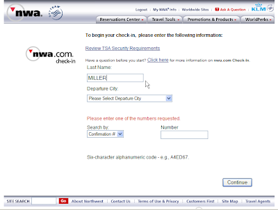
Computers should acommodate humans and make their lives easier...not the other way around.
Build web forms with that in mind. For example, let users enter their first name, then their last name...let the computer reshuffle the deck on the backend if necessary.
Please comment to report any similarly badly-behaving forms you've seen.
Northwest Airlines provides a great example of one of my pet peeves: forms that ask for information the way the company (or their computer) wants it rather than the way a real human is used to providing it.
Northwest's online Check In form should be really simple. You only have to enter three (3) things to check in for a flight. What surprised me so much that it threw me off-track was that when you enter your last name, the site forces the data into uppercase. That's right, no matter the status of the CAPS Lock key or the Shift key your last name shall be displayed in ALL CAPS. THUS SAYS NORTHWEST AIRLINES!
Like any good human, seeing my name in ALL CAPS was discomforting. It made me double check that CAPS Lock wasn't on. It made me try to type it with the Shift key down to make it not ALL CAPS. Evidently NORTHWEST AIRLINES can only understand my name in ALL CAPS. NORTHWEST AIRLINES must still be using old mainframe systems that don't support a full ASCII character set. NORTHWEST AIRLINES wants me to think like an old mainframe system.
NORTHWEST AIRLINES forgot that the system that will accept my input easily has the cpu power and cycles to transform mY NaMe into ALL CAPS in a matter of nanoseconds.

Computers should acommodate humans and make their lives easier...not the other way around.
Build web forms with that in mind. For example, let users enter their first name, then their last name...let the computer reshuffle the deck on the backend if necessary.
Please comment to report any similarly badly-behaving forms you've seen.
June 01, 2007
Make It a Beautiful Day in the Neighborhood
I just read 15 Reasons Mister Rogers Was the Best Neighbor Ever. For those of you who grew up watching Mr. Rogers' Neighborhood, it's well worth the read. If you don't know much about Fred Rogers, you should read it. He was an amazing person, and helped shape many a young child's mind.
Mr. Rogers provided a safe, peaceful, comforting learning experience for kids. His lessons were universal and valuable. His show was a study in simplicity. His style was far from flashy. All of this yielded a powerful, and long-running career that touched millions.
UX workers, product designers and businesses can learn a lot from Mr. Rogers.
"Listen to the children, learn about them, learn from them. Think of the children first."- Fred Rogers
(If you change the word "children" above to "users", it's a wonderful user-centered design or usability maxim.)
See also:
- Wikipedia: Mr. Rogers' Neighborhood
- Mr. Rogers' message (with video) about his web site
- Mr. Rogers' Thoughts for All Ages including communication, parenting, and growing in adulthood
I just read 15 Reasons Mister Rogers Was the Best Neighbor Ever. For those of you who grew up watching Mr. Rogers' Neighborhood, it's well worth the read. If you don't know much about Fred Rogers, you should read it. He was an amazing person, and helped shape many a young child's mind.
Mr. Rogers provided a safe, peaceful, comforting learning experience for kids. His lessons were universal and valuable. His show was a study in simplicity. His style was far from flashy. All of this yielded a powerful, and long-running career that touched millions.
UX workers, product designers and businesses can learn a lot from Mr. Rogers.
"Listen to the children, learn about them, learn from them. Think of the children first."- Fred Rogers
(If you change the word "children" above to "users", it's a wonderful user-centered design or usability maxim.)
See also:
- Wikipedia: Mr. Rogers' Neighborhood
- Mr. Rogers' message (with video) about his web site
- Mr. Rogers' Thoughts for All Ages including communication, parenting, and growing in adulthood
April 27, 2007
Google Image Labeler
Google Image Labeler
A great example of getting users to provide metadata ("tags") if you make it fun. The Google Image Labeler makes tagging images into a game you play in real-time with another user online. You get "points"...and maybe some entertainment along the way.
Hmmm...does it have potential for use on intranets of large companies? Possibly.
A great example of getting users to provide metadata ("tags") if you make it fun. The Google Image Labeler makes tagging images into a game you play in real-time with another user online. You get "points"...and maybe some entertainment along the way.
Hmmm...does it have potential for use on intranets of large companies? Possibly.
April 17, 2007
No one belongs here more than you. Stories by Miranda July
A New Approach to Writing for the Web
No one belongs here more than you. Stories by Miranda July
You could say the author takes a new interpretation of the term "web appliances."
No one belongs here more than you. Stories by Miranda July
You could say the author takes a new interpretation of the term "web appliances."
Sitemaps are Stupid
(Guides are good)
I've thought that sitemaps are a Bad Idea for about 10 years now. Ten year later I finally got around to writing a blog post about why I think they are stupid. Here are a few things to consider:
1. A sitemap is usually just a replication of the existing site navigation. A sitemap (aka "site map") takes all the main navigation items, and maybe a second level of navigation items, and plops them onto a page called "sitemap". So a sitemap usually just replicates the sites existing navigation structure -- this doesn't help anybody.
2. A site should work without a sitemap. Between a site's main navigation and search options, most users needs should be fulfilled. If a site's navigation doesn't work for users, the ability to see all the unhelpful navigation items on one page probably isn't going to help much.
3. Heavy use of a sitemap is a sign of deeper problems. If a site's main navigation works well for users, no-one will click on the sitemap link.
One of the few times sitemaps help is when the main navigation labels don't represent the user's terminology. So, for example, if a user doesn't understand what is meant by "solutions", and they go to a sitemap page that shows the list of sub-topics under solutions, that might help them. So a sitemap can help if a site's structure, labels, or interaction design are getting in the way (i.e., they aren't very usable for those users). See point #3 above.
In my experience watching users during usability tests, I've observed a few patterns:
- Users don't look for sitemaps because not all sites have them.
- Users don't click on (or look for) sitemaps if the site's navigation and/or search satisfy their needs.
- Users who end up looking for or clicking on a sitemap link are rarely helped, often saying something like "that's just the same stuff I was looking at on the home page".
So, sitemaps are a type of page that usually have no value to site users*. Page types that seem similar to sitemaps, but that tend to have more value are indices, tables of content, and guides.
Other than the polar bear book, you don't hear much discussion of guides, so I thought I'd point to some examples.
Here are some examples of guides:
- CNet TV Buying Guide
- About.com - Taking Photographs
- Fool.com Insurance Center
- Mayo Clinic: Women's Health
- Fidelity: Retirement Planning
- Lowes: Doors & Windows
* Note sitemaps.org points out one valuable use of sitemaps for non-humans: search engine crawlers. They promote the idea of an XML sitemap that crawlers are pointed to from the ever-popular robots.txt file.
(Guides are good)
I've thought that sitemaps are a Bad Idea for about 10 years now. Ten year later I finally got around to writing a blog post about why I think they are stupid. Here are a few things to consider:
1. A sitemap is usually just a replication of the existing site navigation. A sitemap (aka "site map") takes all the main navigation items, and maybe a second level of navigation items, and plops them onto a page called "sitemap". So a sitemap usually just replicates the sites existing navigation structure -- this doesn't help anybody.
2. A site should work without a sitemap. Between a site's main navigation and search options, most users needs should be fulfilled. If a site's navigation doesn't work for users, the ability to see all the unhelpful navigation items on one page probably isn't going to help much.
3. Heavy use of a sitemap is a sign of deeper problems. If a site's main navigation works well for users, no-one will click on the sitemap link.
One of the few times sitemaps help is when the main navigation labels don't represent the user's terminology. So, for example, if a user doesn't understand what is meant by "solutions", and they go to a sitemap page that shows the list of sub-topics under solutions, that might help them. So a sitemap can help if a site's structure, labels, or interaction design are getting in the way (i.e., they aren't very usable for those users). See point #3 above.
In my experience watching users during usability tests, I've observed a few patterns:
- Users don't look for sitemaps because not all sites have them.
- Users don't click on (or look for) sitemaps if the site's navigation and/or search satisfy their needs.
- Users who end up looking for or clicking on a sitemap link are rarely helped, often saying something like "that's just the same stuff I was looking at on the home page".
So, sitemaps are a type of page that usually have no value to site users*. Page types that seem similar to sitemaps, but that tend to have more value are indices, tables of content, and guides.
Other than the polar bear book, you don't hear much discussion of guides, so I thought I'd point to some examples.
Here are some examples of guides:
- CNet TV Buying Guide
- About.com - Taking Photographs
- Fool.com Insurance Center
- Mayo Clinic: Women's Health
- Fidelity: Retirement Planning
- Lowes: Doors & Windows
* Note sitemaps.org points out one valuable use of sitemaps for non-humans: search engine crawlers. They promote the idea of an XML sitemap that crawlers are pointed to from the ever-popular robots.txt file.
March 30, 2007
Thatsalottaroadsigns

Signs
Originally uploaded by acmelucky777.
Signs
Originally uploaded by acmelucky777.
21 North going once, twice...sorry ma'am, you just missed your exit.
March 29, 2007
Friendly Wizard of the Day

Unused icons where?
Originally uploaded by allan.rojas.
Unused icons where?
Originally uploaded by allan.rojas.
The desktop cleanup wizard will zap those pesky unused icons that you worry about every day.
Now if they'd just come up with an "Email Inbox Cleanup Wizard" that throws all your unopened, unanswered and/or unwanted email into a folder on you desktop...THAT would be really helpful.
Command Line vs. Graphical User Interfaces
(or "Do you know what you want, or would you like the soup of the day?")
A recent poster to a usability email list pointed out that command line interfaces can be more efficient than GUIs once they are learned. He had even found a web site that offers a command line for web browsing. http://www.yubnub.org/.
This brought to my mind a few analogies that I'd like to share here:
Command Line (CLUI)
...is like ordering a meal from a short order cook, when you know what they can serve, how they can prepare it, and exactly how to order it.
For example:
"Hey, Mac, give me a Pope Benedict and Sweet Alice with mystery in the
alley, on wheels"
(To decode this, see http://en.wikipedia.org/wiki/Diner_Lingo)
Graphical User Interface (GUI)
...is like having a menu (opportunistic pun) and a waiter who tells you what the specials of the day are. Of course, half of the time, after you order they tell you that they're out of that.
GUI "Specials of the Day" today:
1. "Do you know you have unused icons on the desktop?" and
2. "Microsoft Update, Adobe Updates, Google Updater, and Installshield Updater all have updates for you to download and install...Mr. 'I have nothing else to do but keep my software updated'...oh, and did I mention that your two anti-virus and three spyware apps all need updates? The next time you visit, maybe I can interest you in upgrading your firewall to something other than that free version that came with your computer."
The GUI Fast Food Server: Mr. Wizard
"Great...so you're ordering the #2. Would you like fries with that? Are you sure? Please read this Fries 2.0 license agreement and select 'I Agree' before continuing. Great. Where would you like me to put the fries? Installing potatoes...Oops, sorry, there's not enough space left on your plate."
Additional Resources:
- Don Norman Essay: UI Breakthrough-Command Line Interfaces
- Answers.com: Command Line Interfaces
- Scott Isensee: Revival of the Command Line?
(or "Do you know what you want, or would you like the soup of the day?")
A recent poster to a usability email list pointed out that command line interfaces can be more efficient than GUIs once they are learned. He had even found a web site that offers a command line for web browsing. http://www.yubnub.org/.
This brought to my mind a few analogies that I'd like to share here:
Command Line (CLUI)
...is like ordering a meal from a short order cook, when you know what they can serve, how they can prepare it, and exactly how to order it.
For example:
"Hey, Mac, give me a Pope Benedict and Sweet Alice with mystery in the
alley, on wheels"
(To decode this, see http://en.wikipedia.org/wiki/Diner_Lingo)
Graphical User Interface (GUI)
...is like having a menu (opportunistic pun) and a waiter who tells you what the specials of the day are. Of course, half of the time, after you order they tell you that they're out of that.
GUI "Specials of the Day" today:
1. "Do you know you have unused icons on the desktop?" and
2. "Microsoft Update, Adobe Updates, Google Updater, and Installshield Updater all have updates for you to download and install...Mr. 'I have nothing else to do but keep my software updated'...oh, and did I mention that your two anti-virus and three spyware apps all need updates? The next time you visit, maybe I can interest you in upgrading your firewall to something other than that free version that came with your computer."
The GUI Fast Food Server: Mr. Wizard
"Great...so you're ordering the #2. Would you like fries with that? Are you sure? Please read this Fries 2.0 license agreement and select 'I Agree' before continuing. Great. Where would you like me to put the fries? Installing potatoes...Oops, sorry, there's not enough space left on your plate."
Additional Resources:
- Don Norman Essay: UI Breakthrough-Command Line Interfaces
- Answers.com: Command Line Interfaces
- Scott Isensee: Revival of the Command Line?
March 22, 2007
User Research Doesn’t Prove Anything :: UXmatters
Samples and Stats
There's some good stuff in this UXmatters article: User Research Doesn’t Prove Anything. The sections on sampling and statistics are very nice summaries for UX practitioners. I've met many UX practitioners who either:
- never learned these subjects in school
- forgot the relevant lessons
- think that you can gloss over these points in business
Being accurate is important. There is a difference between saying "78% of users think…" versus "78% of the research participants think…”. Yet, I've seen people who think that in order to write things understandably in "plain language", you need to sterilize the message of anything sounding statistical. They try to convey the "jist" of the statistics without sounding like a statistician.
Sloppy research, sloppy statistics and inaccurate wording of findings will lead to haphazard business decisions. It's not good enough that you get your client to make the "right" decision. "Professionals" shouldn't have the attitude that the "ends justify the means".
We have an ethical responsibility to our clients, and to our users, to report accurate statistics from our research. You don't have to kill your clients with stats...just be accurate with the stats you report.
We should help our clients understand our research, the data, and the statistics that are used in the analysis. Not only will they better appreciate the skills we bring to the table, but they will be smarter clients when confronted by other opinions or seemingly contradictory "research". In short, be accurate, and educate your clients rather than dumbing things down for them.
Additional resources
- UPA Code of Professional Conduct
- Measuring Usability
There's some good stuff in this UXmatters article: User Research Doesn’t Prove Anything. The sections on sampling and statistics are very nice summaries for UX practitioners. I've met many UX practitioners who either:
- never learned these subjects in school
- forgot the relevant lessons
- think that you can gloss over these points in business
Being accurate is important. There is a difference between saying "78% of users think…" versus "78% of the research participants think…”. Yet, I've seen people who think that in order to write things understandably in "plain language", you need to sterilize the message of anything sounding statistical. They try to convey the "jist" of the statistics without sounding like a statistician.
Sloppy research, sloppy statistics and inaccurate wording of findings will lead to haphazard business decisions. It's not good enough that you get your client to make the "right" decision. "Professionals" shouldn't have the attitude that the "ends justify the means".
We have an ethical responsibility to our clients, and to our users, to report accurate statistics from our research. You don't have to kill your clients with stats...just be accurate with the stats you report.
We should help our clients understand our research, the data, and the statistics that are used in the analysis. Not only will they better appreciate the skills we bring to the table, but they will be smarter clients when confronted by other opinions or seemingly contradictory "research". In short, be accurate, and educate your clients rather than dumbing things down for them.
Additional resources
- UPA Code of Professional Conduct
- Measuring Usability
March 16, 2007
Web 2.0
If you haven't seen this video from YouTube entitled "Web 2.0...The Machine is Us/ing Us"...you should.
It's notable not just for the points the author is making, but for the really cool techniques used. The style is simple and great.
http://www.youtube.com/watch?v=6gmP4nk0EOE
Let me just add that...
We'll need to rethink usability.
Additional Resources:
- Wikipedia: Web 2.0
- AJAX Usability Metrics (PPT)

If you haven't seen this video from YouTube entitled "Web 2.0...The Machine is Us/ing Us"...you should.
It's notable not just for the points the author is making, but for the really cool techniques used. The style is simple and great.
http://www.youtube.com/watch?v=6gmP4nk0EOE
Let me just add that...
We'll need to rethink usability.
Additional Resources:
- Wikipedia: Web 2.0
- AJAX Usability Metrics (PPT)

February 12, 2007
Your next "car"?
BodyRite: HyperBike.
I wonder if this contraption comes with drink holders or an mp3 player...
BodyRite: HyperBike.
I wonder if this contraption comes with drink holders or an mp3 player...
January 26, 2007
January 23, 2007
Joel's review of Dreaming in Code
Joel Spolsky's post The Big Picture has some great UI design points to make:
First, that you need to DESIGN first, and that many projects fail because people jump right into coding without a design:
"This is a particularly dangerous trap when it comes to software development. You get some big picture idea in your head for what you want to do, and it all seems so crystal clear that it doesn’t even seem like you need to design anything. You can just dive in and start implementing your vision."
Second, that a risk of abstract thinking (often done by architects) is that you can quickly leave real-world concepts, and users, behind.
"'No Silos' was supposed to mean that instead of having your email in one silo, and your calendar in another silo, and your reminder notes in a third, there would just be a single unified silo holding everything."
...I think the idea of “No Silos” is most appealing to architecture astronauts, the people who look at subclasses and see abstract base classes, and who love to move functionality from the subclass into the base class for no good reason other than architectural aesthetics. This is usually a terrible user interface design technique.
Joel Spolsky's post The Big Picture has some great UI design points to make:
First, that you need to DESIGN first, and that many projects fail because people jump right into coding without a design:
"This is a particularly dangerous trap when it comes to software development. You get some big picture idea in your head for what you want to do, and it all seems so crystal clear that it doesn’t even seem like you need to design anything. You can just dive in and start implementing your vision."
Second, that a risk of abstract thinking (often done by architects) is that you can quickly leave real-world concepts, and users, behind.
"'No Silos' was supposed to mean that instead of having your email in one silo, and your calendar in another silo, and your reminder notes in a third, there would just be a single unified silo holding everything."
...I think the idea of “No Silos” is most appealing to architecture astronauts, the people who look at subclasses and see abstract base classes, and who love to move functionality from the subclass into the base class for no good reason other than architectural aesthetics. This is usually a terrible user interface design technique.
Subscribe to:
Posts (Atom)