June 22, 2005

Take the MIT Weblog Survey

If you're a blogger...think about taking the survey.

[Via Mena at Six Apart]

June 21, 2005

Your web site might be a pain in the neck if...(with apologies to Jeff Foxworthy)

If your home page has four navigation bars, and "investor relations" is in two of them...your web site might be a pain in the neck.

If mousing over your main navigation bar causes content and colors to change in a totally different section of the page...your web site might (literally) be a pain in the neck.

If your global corporation's home page has seven main navigation sections and two of them are called 'Tools' and 'Information'...your web site might be a pain in the neck. (You've gotta love the "Customer Information" and "Hub of Excellence" pages under the "Information" section, not to mention the "Good Morning" greeting I'm seeing at a little past midnight!)

If your home page has a prominent "hints" link...your web site might be a pain in the neck.

"Our site is organized to help you quickly find the information you need with a minimum of “clicks”. In addition to the links on each page, you can use our drop down menus to find information sorted by product name, medical condition, even by Abbott division."
(Abbott Laboratories - Hints)

June 10, 2005

Blogger's doing Usability Testing

Send your blogging friends here if they live near Mountain View, California.

June 09, 2005

Welcoming 3D to the blog world

DeeDee DeMulling ("3D") has a blog. DeeDee is a usability/UCD/product design consultant in the Twin Cities area (Minneapolis / St. Paul).

Product Experience

June 08, 2005

Logo Trends 2005
Graphic Design USA - LogoLounge.com’s Third Annual Visual Trends Report

"Trends are not an accusation of some widespread lack of original thinking. Instead, they are a sign of design evolution in our ever-shrinking world."

June 07, 2005

Ten Years of Alertbox - Thanks Jakob

Jakob Nielsen's Alertbox is 10 years old.

Jakob's Alertbox was one of, if not THE first usability column I started reading after taking a 5-day GUI design (UCD) class from Susan Weinschenck around June 1996 (she's now at HFI). I was designing web sites and had to keep asking Susan about how UCD concepts (or the design guidelines presented) would apply to a web user interface (WUI). Susan was very helpful (having consulted on some web projects). She left us with a list of "other resources" which included useit.com...and so I found Jakob.

In those days, the Alertbox was very informative, discussing web design issues I was dealing with on a daily basis...and I read it religiously every week and learned a great deal. Reading the Alertbox lead to more reading, and more learning from other experts in the field.

As the web/ecommerce thing "boomed", Jakob's public persona moved from mentor to "guru". He formed NNG, wrote lots of books that sold in huge numbers, and the Alertbox seemed to become reduced to a marketing vehicle: a way to sell research reports, books, and training. Meanwhile, Jakob was being interviewed by every tech publication imaginable, along with newspapers and traditional media. Jakob was on CNN TV news one night. Jakob became the poster boy for web usability. This earned him the ire of many practitioners and web designers...yet raised the awareness of usability nonetheless.

Jakob should get a lot of credit for the attention he's brought to usability issues and practitioners trying to address usability issues. Of course, I'm sure, Jakob's made a pretty penny along the way, and good for him...he's also happy to claim credit for improvements in web usability. Of course he's done his share of the work on that, but there are also tens of thousands of other practitioners out there spreading the "gospel" and doing the work.

I can't say I know Jakob well, but I have traded email with him a few times, chatted with him at conferences, and found him to be a decent fellow. While his public persona might come off as an egotistical, critical know-it-all, I like to remind myself and others that this is just his public face...probably not his real personality. My blog readers don't know the "real" me either...not that I become some Hyde to my everyday Jekyll once I hit Blogger...it's just that people only see bits and pieces of me through the pinhole which is my blog. So I try to cut Jakob some slack, and acknowledge that he's done me (personally) a lot of good not only by offering advice and opinions, but by being the visible, seemingly "know-it-all" guru of usability.

I don't read the Alertbox regularly anymore, but stay aware of what Jakob's talking about. Even if *I* don't learn much, or disagree with him, the fact is many people *read* Jakob's stuff, so I want to be aware of what he's talking about.

In his 10 year anniversary Alertbox article, Jakob said (emphasis mine):
"When I conducted my first user tests of websites and intranets in 1994, I was probably the only person in the world with this esoteric interest. Web people didn't care about usability, and usability people didn't care about the Web. After years of incessantly promoting user research findings for websites and intranets, the situation has changed: thousands of people now work on online usability."

Jakob helped educate me about usability, and ended up helping me convert from a "web person who cared about usability" to a "usability practitioner who cared about the Web." Now I'm helping to convert others. I feel like saying "the Alertbox is dead, long live the Alertbox!"

Thanks Jakob!

May 27, 2005

May 11, 2005

Yahoo plucks Amazon.com design guru

CNET News.com reports:
"Internet giant Yahoo has named Larry Tesler, a veteran design engineer at Amazon.com, to lead efforts in shaping its consumer experience.

Tesler, 60, will be vice president of Yahoo's user experience and design group, reporting to Geoff Ralston, the company's chief product officer. He will also be a research fellow in Yahoo's Research Lab, focusing on 'human-computer interaction.'

Tesler helped craft Amazon's shopping experience over the last three-plus years as a vice president for the Web retail behemoth. He has also held positions at Xerox's Palo Alto Research Center, or PARC, and at Apple Computer, where he worked for 17 years as chief scientist and vice president of engineering, among other roles.

At PARC, Tesler pioneered computing techniques such as 'cut and paste' that have become standard to graphical user interfaces.

'Larry has the ability to draw on his extensive knowledge of both computer science and user-centered design to help define and drive product strategy and innovation at Yahoo,' Ralston said in a statement."

May 03, 2005

Dvorak: "Kill Outlook Express Today"

John C. Dvorak of PC Magazine does a good scorch-job on Outlook Express, focusing on a number of usability issues in an article called "Kill Outlook Express Today".

"I can tell you this much. If Microsoft persists in using this old code as the free e-mail program in Longhorn, I'm switching to Linux. It would indicate that the company really does not care squat about its customers." [While not fixing OE might indicate some lack of concern for its users, he's clearly exaggerating here. A switch to Linux could clearly be a potential frying-pan-to-fire move as well.]

"And, mind you, this is Outlook Express 6! Microsoft has gone through six iterations of this code and still hasn't fixed this, even with their usability labs and usability experts? Incredible."

Inquiring usability minds want to know if MS consulted with or listened to their usability experts when it came to OE. MS has lots of capable UX folks.

Clearly a free, scaled down version of a commercial product shouldn't be expected to have all the same features as a full commercial product (e.g. you could argue this about the spell checker and color coding features), but issues like inconsistent menu bars and modal action buttons should be caught in usability testing and fixed. A good quality, "lite" version of a product, with fewer features should be thought of as a good sales tool for the full-fledged product (Outlook 2003 in this case). If Outlook Express' quality is poor, what user would want to fork over the cash for it's "big brother"?
Payphones of the World

An interesting survey of different pay phone designs.

Here's a crude looking example from Armenia

And here's a humorous looking one from Turkey.

Note the web site itself isn't the most usable. I had some problems trying to navigate using the maps and found the text links more reliable.

May 02, 2005

New Sun.com Design

Congratulations to the Sun.com team.

Sun.com: A fresh new look has some nice before and after screenshots.
Band-Aid Design Evolution

The Journal Gazette has a nice story on the history of the Band-Aid and it's evolution:

Inventor stuck to design goals with earliest Band-Aid

April 27, 2005

How to say "hi" in 15 different countries

The Business of Touch from Aquent uses Flash (sometimes effectively, and sometimes gratuitously) to demonstrate the cultural differences in business greetings (e.g. shaking hands) in 15 different countries. The use of Flash helps show the action (e.g. a bowing motion). In some cases, the design uses animation to distraction - in the case of the China example where colored patches move and shake - obscuring the action of the illustrated actors. Another drawback of using Flash is you can't link to an individual example (i.e. "page"). The content is pretty interesting, although they could've done a better job of citing sources or linking to additional information.

It's intended as a marketing piece to get you to hire Aquent designers...and should be considered from that standpoint.

April 20, 2005

Dumb Email of the Day

I received an email today that just made me laugh because of how ridiculously written it was. It went a bit like this (details omitted to keep the source anonymous):

"I work with [Company name] a [blah blah] company that is looking for a [Job Title 1] and a [Job Title 2]. I was hoping to network with you and would appreciate any referrals. Perhaps you might be looking for a new opportunity?

[More about the Company]

"As we continue to grow, we are looking for professionals to help take us to the next level.

[Job Description 1]
[Job Description 2]

"For more information, visit www.Company.com/ and www.Company.com/company/careers

[More about the Company]

"To apply, reply to this email or send your resume to opportunities@Company.com.

"For unwanted future emails reply with out in the subject line

[Company name]
[Address]
[City, St, Zip]"


What really struck me was the line "I was hoping to network with you"...from a stranger, who, as far as I know, got my email address off a web site somewhere. What's more, this person who wants to "network" with me didn't even bother with the courtesy of signing their name to the email. Did they think I wanted to "network" with their faceless company? The jobs were very related to my field of work, but I wouldn't even consider for a moment refering anyone I know to a company that communicates this way. If they recruit in a selfish, semi-anonymous way using tactics similar to those espoused by spammers, who would want to actually work for them?

Here's a better way to go about it: "Hi, my name is John Doe, I work for SomeCompany. I noticed you are a member of the Usability Professionals Association (or whatever other group's site you got my name from), and we are looking for talented professionals in this field. I thought you might be interested in our open positions or know someone else who might be interested." Then tell me a bit about the jobs, with a link to your company's web site for more about what the company does. Feel free to tell me why this is going to be an exciting place to work in those roles. The more open you are, the more people might be interested. Include an email address and a phone number. Better yet, include the hiring manager's contact info (not just the HR person's who doesn't really know squat about the job).

...Another funny item is the last line of the email: "For unwanted future emails reply with out in the subject line" What this really states is "if you'd like unwanted future emails, reply with the word "out" in the subject line." All I can say is "Sure, sign me up for more of those 'unwanted future emails,' would you please?"

April 06, 2005

New Mobile Device Interaction Techniques?

In a press release from F-Origin entitled "F-Origin Announces Radical User Interface Technologies That Make Using Mobile Devices Easy and Intuitive"

"HaptiTouch, a touch screen system with tactile feedback, brings the simplicity of human touch to mobile devices, effectively removing the need for keypads, stylus, and other pen-like input devices. Through HaptiTouch software, users' interactions may be complemented with various tactile responses, producing a mechanical feedback sensation from the familiar key as well as audible effects when desired."

"Book UI is an innovative menu paging system that allows easy-to-understand book-like indexing while moving through items and categories by simple finger movements on the viewing display. Book UI allows the user to move from one menu page to another in the same manner a page on a book is turned. Once the desired item is found, the user presses on the item to select it."

"Iris, a motion-based viewing technology, views large content on small displays by tilting the device without repurposing the content. Iris software allows the user to navigate and pan across a viewing page, zooming and presenting the content vertically or horizontally depending on the orientation of the device in the user's hand."


Iris seems the most ambitious to me and the most likely to not work in mobile contexts. There's a visualization of how Iris might work on the F-origin site.
Innovation in Electronic Dictionaries

An example of trying to extend the usefulness of a tool by thinking about the user (and in this case, the word's) context:

"Rather than just looking at a single word that has been selected in a text, it analyzes the whole sentence in which the word appears, making use of extended linguistic and lexical data to arrive at precisely the meaning and the translation that will fit the given context."

March 30, 2005

Design Quote of the Day

"While one person hesitates because he feels inferior, another is busy making mistakes and becoming superior."
- Henry C. Link

This quotes makes me think about how, often in business, user-centered design (UCD) is used to help us learn from our mistakes. Companies or teams who hesitate (or fail to identify and understand their mistakes) remain inferior when compared with teams iteratively designing, testing, and redesigning... UCD helps build superior products and companies - by learning from mistakes, usability practitioners create competitive advantage.

March 29, 2005

Apple's iPod Shuffle Design Gets Ripped-off!

...or does it?

A story that broke a few days ago at CeBIT, a major electronics expo, has evolved. It initially looked like taiwanese company Luxpro had ripped off the design (and product concept) of the iPod Shuffle to make a "Super Shuffle". They also displayed it in ways that minimicked the Apple iPod marketing campaign. Apple lawyers were called. People got upset...and for good reasons.

Now it looks like it might have all been a publicity stunt. According to Jack Campbell of DVForge (quoted in the engadget article above):

"The Super Shuffle is not in production by LuxPro." and "The entire CeBit sideshow was planned from the start as a gambit to gain a hugely disproportionate share of the industry’s attention, so as to find a few customers for the Super Shuffle’s electronics."

So the moral of the story is basically, if you're a technology company with no product design expertise, it's okay to rip off another company's design and marketing campaign in order to market your own competing services and technology...as long as you don't put the product on the market.

March 22, 2005

If Your Home Page Could Only Talk

This article is quite funny. A great example of criticism via satire. Here are a couple of excerpts:

"First, let me say, I have no idea who you are, or why you came, but believe me when I say, I built my site just for you. My company and products are the best there is to offer."


"Contacting me is easy. Just fill out the form when you find it. When you find the privacy policy, please take an hour to read that. Basically it says I don't have time to record your data and don't care who you are. I'm only interested in selling you something that has my company name on it."

"The product catalog is to the left of that big fat image on the right of the homepage that's distracting you. Above the two global navigation schemes in the top header is your login area. To register, you need to first give me your phone number so I can call you at 3am and tell you about my specials. I put the search box at the bottom of the page, so you can find things quickly. The sitemap needs to be updated, sorry. We put it there for search engines to crawl and then forgot we had it. "

March 21, 2005

Do users really cares about culture when it comes to web design?

I found this quite curious:

"One of the most time consuming conversations in the company is the extent to which the look & feel of this template is appropriate for each local market, with country managers always claiming that the site needs to have a more local look & feel.

This is despite the fact that we have standardized our offline brochure design worldwide for years. The only country we have tested this on is Korea, where we implemented a 'Korean' looking homepage to appease the country manager, and found it had no impact on conversion."


From MarketingSherpa.com: Standard Global Site Templates Beat Asia-Specific Design

And from an earlier story MarketingSherpa.com: Exclusive Results Data from VistaPrint's Top 10 Marketing Tests:

Test #10. Generic versus cultural Web design

Although VistaPrint hires a native of each country to be in charge of marketing for his or her own country's site, the sites are constructed using generic templates. Language and prices are translated of course, but not overall style.

Holian figured it might not be optimum, but this system saved a great deal of wear and tear on the site design and engineering team.

But when VistaPrint launched in Japan, the Japanese-born marketer absolutely insisted the company develop a cultural-specific site.

Holian agreed to a test. So the company launched not one but two Japanese sites -- one using the standard template and the other copying typical Japanese site design -- and split incoming traffic.

The standard template won. Looking like a Japanese site wasn't critical as long as the language and pricing were localized.


Of course, they don't provide any details on their test methodology or any real data...so I'm left curious what other research might confirm or dispute these findings.
Tim Berners-Lee, web inventor, compares mobile web design to accessible web design

"Web designers have learned to design for the visually impaired and for other people. They will learn in a few years how to make Web sites available for people with mobile devices, too," Tim Berners-Lee said today at a seminar on the future of the Web.

From Web design hampers mobile Internet, Berners-Lee says - Computerworld

December 10, 2004

Don't do as I say...

SAP Design Guild -- Golden Rules for Bad User Interfaces

"As people like to do just the opposite of what one is proposing, we thought that it might be a good idea to promote bad user interface design."

December 09, 2004

Airhead design of the day

Thanks to Form Function Emotion for this goodie (with photos):

"This machine is high tech. It has buttons so you can set the correct pressure for your tyre, and then all you have to do is press another button, and the machine will automatically pump the type up to the right presure. And it is in this cleverness that causes problems..."

Form Function Emotion: Coming up for Air

December 08, 2004

Simply calling something "Research" isn't good enough

An article in Wired News - Florida E-Vote Study Debunked - points out that serious research must be done in a responsible fashion.

"A study by Berkeley grad students and a professor showing anomalies with electronic-voting machines in Florida has been debunked by numerous academics who say the students used a faulty equation to reach their results and should never have released the study before getting it peer-reviewed."

"If I were to get this article as (an academic) reviewer, I would turn it around and say they were fishing to find a result," Stewart said. "I know of no theory or no prior set of intuitions that would have led me to run the analysis they ran."


November 29, 2004

The Usable Consultant

An article by Dave Rogers in the Gotomedia newsletter contains
a definition of "consultant usability":

"The extent to which a consultant helps people to achieve specified goals with effectiveness, efficiency and satisfaction within the realities of their organization."

He makes some great points:

- Usable consultants listen obsessively
- Usable consultants generously share knowledge and information
- Usable consultants don't boilerplate
- Usable consultants join the team
- Usable consultants help you achieve goals

November 18, 2004

Gates Is World's Most 'Spammed' Person

"Gates, Microsoft's chairman, gets 4 million e-mails a day and is probably the most 'spammed' person in the world, his Chief Executive Officer Steve Ballmer said Thursday."

At the height of my personal battle with spam, I received as many as 282 spam per day, and the average was about 200 per day. I estimated that it took at least 20 minutes per day to deal with these spam. That doesn't include time setting up rules and exceptions list in my email client and tracking my spam problem (in the interest of getting someone to address it.) Due to new anti-spam tools, the number is now much more manageable.

What kind of impact has spam had on you? Leave a comment.

November 15, 2004

Stoplight Design

Why are stoplights Red, Yellow and Green?

"Stoplights are red, yellow, and green, because traffic officials, early on copied the code system railroad engineers devised for track systems controlling the trains."

And something interesting I learned from reading "From cells to bells, 10 things the Chinese do far better than we do"

"In Tianjin, a city of 13 million people, traffic lights display red or green signals in a rectangle that rhythmically shrinks down as the time remaining evaporates. In Beijing, some traffic lights offer a countdown clock for both green and red signals. ... During a red light, you know whether you have time to check that map; on a green light, you know whether to start braking a block away -- or to stomp on the accelerator, as though you were a Toronto or Montreal driver. (That's probably why Montreal has a few lights with countdown seconds for pedestrians.)"

At what point is it worthwhile to change your standards if a better design is evident? I can't imagine the cost of rolling out new stoplight designs across the US. The cost for education and awareness alone would be huge. Yet, if it would prevent accidents and driver frustration, maybe it'd be worth it. Just thinking about the "business case" for analyzing the cost/benefit makes my head hurt, not to mention the political battles that would have to be won...

What do you think? Leave a comment...

November 03, 2004

AMR Research Says "The New Game is Ease of Use and Accessibility"

Here's a must read: AMR Research: Functionality Is Dead, and some excerpts from it:

"But rather than be a sporadic phenomenon, ease of use and accessibility are about to enter a time in which they will become a selection metric on par with technology and functionality. AMR Research has been spotting this trend for the last year or so." ...

"If no one uses it, it doesn't matter
These examples and others serve as a reminder to IT and business managers that while technological and functional requirements are important, so too are applications that will be embraced by real people. One of the largest problems that enterprise applications have is that they are too hard to use. For such applications, if users can avoid them to get their job done, history has shown that they will. This truth has manifested itself in countless enterprise applications being used the bare minimum, which has made it harder for IT organizations to show a positive return on their investment."

A more to-the-point way of stating the last sentence is "Lack of attention to usability has made it harder for IT organizations to show business value." AMR hit the nail on the head with this one. Technology pushers need to wake up.

October 10, 2004

CRM Daily: The New Look of E-Commerce: The Customer Experience:

(Note: I've added links where I thought they added value...as good WEB authors should.)

"Usability testing is now a regular part of e-commerce development in retail, banking and financial services and is gaining ground in other sectors. Still, some industry verticals are slow to get the message.

'The auto makers tend to be slaves to their offline ad campaigns,' says Manning. 'They'll do things like design beautiful sites that don't help customers make a buying decision, then pat themselves on the backs when the latest J.D. Power survey confirms that customers do indeed think they have beautiful sites. But who cares? Do they want to win art contests or generate leads for dealers?'

Forrester and other analyst firms are promoting customer experience as a bottom-line issue, which is driving a universal acceptance of usability as a legitimate business metric from the CFO downward. Web managers who underestimate the importance of good Web usability will suffer the consequences -- competitor sites are within easy reach of today's Web surfer.

Competitive Pressure
Many firms are demanding that their ad agencies or Web boutiques, which typically lack in-house usability experts, conduct usability studies on their site development projects. These traditional print and Web-marketing consultancies are looking outside to meet their client's needs for including usability as part of Web-development offerings.

Increased Revenue
Studies have shown that adherence to usability standards and guidelines can drastically improve the revenue potential of a Web site. Customer conversion rates can increase between 30 and 50 percent following a usability intervention. Revenue can increase 50 to 100 percent or more on retail e-commerce Web sites.

For example, RVSearch.com, a retail vehicle-listing Web site, saw an 83 percent increase in consumer-listing conversion rates after usability research was used to re-design the site.

"In the first month, we saw revenue double -- a 100 percent increase in sales. Renewals were up 13 percent in the post-site-deployment period," said David Scifres, vice president of e-commerce for the Affinity Group, the parent company of the site.

"After six months, consumer-listing sales increased by 200 percent, which we attribute to the usability driven re-design. This translates into a four times increase in consumer revenue," he told NewsFactor.

Independent research also is showing more compelling reasons to make calculated and precise shifts in site enhancement or re-design. Stanford Research'songoing large-scale study regarding perception of credibility on the Web shows that ease of use is the top contributing factor to perceived credibility of Web sites.


October 05, 2004

Whither the newspaper?

An article in Editor & Publisher yesterday makes me wonder if in 20 years, the average web site will be more intuitive and comfortable to most people than a newspaper. I can see it now: a high school kid (from the class of 2028) looking at an old, yellowed newspaper from September 11, 2001 and asking Grandma to explain the news format. 'So you're telling me Grandma that this pile of inky paper was called a newspaper? And there's no navigation or search? You had to skip past all this other junk just to get to the comics section? And the articles were already almost a day old by the time you bought it? Geesh, did they have electricity then, or did you have to read it by candlelight too?'

Here are a few excerpts from Washington Post Focus Group Reveals a Shocker: Young People Prefer Newspapers Online:

"Editor Erik Wemple recounted what happened at some focus-group sessions The Washington Post recently conducted with young prospective subscribers in the area, and he speculated that Post news execs are 'haunted' by one particular man.

"'He's a youngish man, a recent law school graduate,' Wemple wrote. 'When presented with a copy of the Post, this fellow fumbled with it, according to sources. He professed he didn't know how it was organized. And the kicker: He expressed wonderment at the spread known as the editorial/op-ed pages.'

"Was this man simply a head-in-the-sand young professional, concerned only with career and social life? Not at all. 'He reads the Post constantly on its Web site,' Wemple reported, ''sometimes for a few minutes, sometimes for a few hours,' according to a source.' And therein lies the problem -- for all newspapers, not just the Post. ...

"Wemple reported that Posties learned the paper's non-subscribers were baffled at why they might want so much newspaper. They were concerned for environmental reasons -- all those trees! -- and they were concerned for practical ones, too: The focus groupers said they didn't want a bunch of newspapers "piling up" around the house. And they also liked the convenience. For younger readers, online is the natural, convenient, and efficient way to get news."

Will biometrics help us get rid of passwords?

After reading this reviiew of a biometric IBM ThinkPad T42, I'm looking forward to the time when biometrics are a standard way of logging into a computer. Swiping a finger across a scanner is so much easier than remembering a bunch of passwords.

What do you think? Will biometrics make systems more usable or is it all a bunch of hype?

September 16, 2004

Bad Statistics Give Me Chest Pains

On the radio last week I heard a local news reporter say of Bill Clinton that "90% of some of his arteries were blocked" (prior to his quadruple bypass). I grimaced and groaned and I think I might have made some derogatory remark about the reporter's intelligence. Ninety percent of *some*???!!! Nothing like being exactly vague with your statistics. Note also that the reporter wasn't specific about which arteries...here we're talking about coronary arteries...not just any old arteries pushing blood around the body.

The facts:
Most reports I heard were more accurate and more successful at communicating a technical statistic to the average "Joe" on the street. For example, this AP photo has a good caption that more accurately states the stat:
"Clinton was at high risk of a heart attack before his quadruple bypass surgery Monday, with several arteries well over 90 percent blocked"

Doing a bit of Googling turns up more inaccuracies in reports of the same story:

"His arteries were 90 percent blocked."
from KABC-TV Los Angeles: Doctors: Clinton Dodged a Major Bullet
...all of his arteries?

"Monday's surgery revealed that his arteries were 90 percent blocked."
from WCVB-TV Boston: After Clinton Scare, Docs Urge Heart Vigilance
...exactly 90%? And again, all of his arteries?

"Clinton remained in intensive care after cardiologists performed a four-hour operation Monday to bypass four clogged arteries. They were so severely blocked that less than 10 percent of the normal blood flow was getting to his heart..."
from New York Post Online: CLINTON'S RECOVERY GOES WELL, DOCS SAY
...Wow! We're not talking about a few arteries that are mostly blocked, we're talking about 90% less blood flow in total to the heart!!!???


When dealing with statistics, whether related to the health of a past President or a recent usability test, it's important to maintain accuracy. Don't try to quote an exact stat unless A) you can get the stat correct, and B) the audience will be able to follow and understand the stat's context and content.

It's one thing to say "in testing we found that most people didn't use the site map" and a totally different thing to say "our tests and third party research show that 73% of users will not find a site map or site index useful in locating detailed product information on consumer web sites." Stats can be difficult to understand, so sometimes having them in print or on a slide can help people understand the stats. (Note, that stat example is entirely made up...)

Finally, if you find yourself trying to summarize a stat, be careful that you're not changing the meaning (as many of the news reporters on the Clinton story did).

September 15, 2004

UCD in Plain Language

An oddly titled article in Technology Marketing magazine - "Headline" - does a good job of describing key tenets of User Centered Design for web sites without getting into a bunch of usability lingo.

"Most sites are built backwards. They start with content. They organize the content. Then they publish the content and tell the audience it's there. This approach could be summarized in this way: 'Content, architecture, audience.' This is the most common process, and it results in sites that are impossible for you to manage and for your customers to navigate.

"Instead, try to start by defining the audiences for your content, then list the actions they want to take, and then you should develop the content that supports those actions. In summary: 'Audience, actions, content.' The audience and their actions determine the content. ...

"You already know whom you're trying to reach. Interview them to find out what actions they want to take and the content that will support those actions. What you learn will result in sites that are refreshingly intuitive for your audiences.

"The bad news? If you design your sites around the audience and their actions, the resulting content set will not include some of your favorite Content Babies. We all have them: that white paper we wrote until the wee hours of the morning, the brochure that took us a year to get approved, etc. We can't stand the thought of leaving our Content Babies out of our content set. But if they don't fit into the "Audience, actions, content model," you'll have to let them go, and replace them with the content that your audience actually wants."

September 08, 2004

I Track, You Track, We All Track for Eyetracking

A new study from the Poynter Institute is out, and this article provides some reviews and critiques of the findings. Jakob Nielsen and Jared Spool are among the "home page umpires." The interactive 'heatmaps' are pretty neat if you've never seen eyetracking data.

Poynter Online - When It Comes to Homepages, It is Polite to Stare

"Eyetrack researchers showed 46 people a variety of mock news websites and followed their eyes as they moved along the pages. Here's what the research found."

See Also:
- Findings of Eyetrack III research from The Poynter Institute

September 07, 2004

New Use of Purple is Critical

After reading this story I'm considering printing all reports from usability test findings or expert reviews in purple. Of course now I just have to figure out which exact shade of violet conveys the most friendly, non-critical tone. If only I'd learned earlier that it's how you color your words rather than how you phrase them that really matters...I could have saved so much time.

I'm sure if Jakob Nielsen had simply said Flash sucks 99% of the time (in purple), his words would have been better received. Just think of all the frustration that could have been avoided.

September 01, 2004

Melts in your mouth, and on the web...

Something I blogged about being broken almost three years ago is still broken today:

You can't buy M&M's where I live

Update: Now I can buy M&M's in one Target store within 15 miles of my zip code (according to the app)...

This example points out something Jakob Nielsen overlooked in his Alertbox article Helping Users Find Physical Locations. Teams designing locators, whether product locators, dealer locators, store locators or whatever, need to make sure that the application has complete and accurate data. While a common usage scenario is that a user is looking for a nearby location, often users are also aware of a nearby location and want to find an address, map or phone number for that location. If the location they are looking for isn't there, they will quickly lose trust in the locator application's ability to provide good information.

I'm not sure if the Nielsen Norman Group's guidelines report talks about the need for good data either. Often, I think usability folks focus on the user interface, and shy away from pointing out issues with content (data) or business strategy. While the M&M locator has content problems, the biggest issue I see is that no one in America needs a product locator for M&M's - the product is a ubiquitous offering at just about any grocery store, gas station or anywhere else that sells candy.

August 30, 2004

Usability Quote of the Day

"Your pain is the breaking of the shell that encloses your understanding."
- Kahlil Gibran

This quote reminds me of facilitating usability tests. Often, the frustration and struggle that users go through is very evident, but that "pain" often is a powerful catalyst for opening up the understanding of the design team, business, or organization conducting the tests. I often have to remind myself that in a usability test, the few suffer to prevent the suffering of the many.

Of course, watching your "baby" you designed fail and frustrate users is painful for the design team...but those teams that subject themselves to that pain suddenly find they have new, tremendous understanding and empathy which refuels their desire to create something compelling and satisfying. The shared "pain" of observing usability tests can help a team gel and focus around critical design issues.

August 26, 2004

Design Quote of the Day

"One who walks in another's tracks leaves no footprints."
- Proverb

Innovation creates "footprints" and is good.

Standards and conventions are necessary, because not all footprints are innovative, valuable, or pretty to look at.

August 24, 2004

Design Quote of the Day

"We are half ruined by conformity, but we should be wholly ruined without it."
- Charles Dudley Warner

Laws and rules stink...but without them we'd have anarchy.

A recent example of where lack of standards created a crisis was the now infamous butterfly ballot in the 2000 U.S. Presidential election. Usability professionals are working to establish standards and recommendations to avoid similar confusion in the future.
Around the World in 80 Clicks

An article by Lisa Battle and Duane Degler written in 2001 has some nice discussion about considerations when designing for international user groups.

Some of the considerations discussed include:
- Language
- Time
- Cultural expectations
- Metaphor and representation
- The user's locale

If you're thinking about internationalization (I18N), globalization, or translation, you should read this over.

The article was originally published in Performance Improvement (EPSS Special Edition), a Journal published by the International Society for Performance Improvement (ISPI)

August 23, 2004

How much does language affect how you think?

A fascinating story called Life without numbers in a unique Amazon tribe on the Globe and Mail site boggles the mind. It talks about an Amazon tribe that has no concept of numbers, no words for colors, and many other cultural characteristics that most civilized people would plainly call "strange."

"Adult Piraha apparently can't learn to count or understand the concept of numbers or numerals, even when they asked anthropologists to teach them and have been given basic math lessons for months at a time.

...the Piraha are the only people known to have no distinct words for colours.

...They have no written language, and no collective memory going back more than two generations.

...They have no creation myths, tell no fictional stories and have no art. All of their pronouns appear to be borrowed from a neighbouring language.

...Linguists and anthropologists who have seen both the Everett and Gordon studies are flabbergasted by the tribe's strangeness, particularly since the Piraha have not lived in total isolation.

The tribe, which lives on a tributary river to the Amazon, has been in contact with other Brazilians for 200 years and regularly sells nuts to, and shares their women with, Brazilian traders who stop by."


The story raises the question of whether or not the inability to describe something prevents you from thinking about it. I think that's a very plausible theory.

August 20, 2004

Moving Forms to the Web

I just found this real gem about forms usability: a PDF handout from Ginny Redish's talk entitled "Moving Forms to the Web" that she gave at Usability University (a US Government training program) in June 2004.

Ginny offers a lot in this little PDF:
- The section called "planning to move forms online" offers a great approach on how to go about researching user and business needs prior to designing an online form. The approach is comprehensive yet pragmatic - something I really appreciate as a practitioner.
- She outlines 17 guidelines for consideration when designing web forms.

Download the PDF Handout from Ginny's site.

I got to know Ginny a bit better at UPA 2004, where she gave a great keynote address on communities. (You can find those slides online too, but one of the reasons her talk was great because it was interactive and engaging with PowerPoint playing a minimal role in the overall mix. Therefore, the slides don't really stand alone.)
Don't Read This Article

Please don't read this trash masquerading as usability advice.

Here are a few tips for the author:
1) Actually know something about the topic you're writing about.
2) Follow your own advice: "If your site [or article] has too much content ensure readability" ... and accuracy, and validity, and clarity, etc., etc., etc. Oh, and if you have to much content...maybe you have too much content.
3) Follow your own advice: "Test for spelling mistakes and grammatical errors." Try using a proofreader.
4) Follow your own advice: Add a sitemap, strategic links, and some XP style icons - I'm sure that will make your article much better.
5) Learn what usability is - if you don't recognize that different sites have different users with different needs, then you'll continue to speak about usability incorrectly and offer ineffective platitudes and generalities that perpetuate unusable web sites. What you're advocating is that people waste a lot of time and money on activities that do little or nothing to make their web site more effective.

People have much better alternatives if they want truly effective tips for designing usable web sites.

August 17, 2004

SEO Without Usability -- An Exercise In Futility

From a WebProNews article by Scottie Claiborne we get a Search Engine Optimization (SEO) article that talks about why site owners shouldn't simply worry about search engine marketing tactics like Google Pagerank optimization, higher rankings, and reciprocal links. If you do somehow manage to drive a lot of traffic to your site, it then needs to be usable or those visitors will quickly go away and you'll lose the sale (or other business opportunity) you seek.

Here are a few excerpts (emphasis is mine):

"[I]n the same way that the average SEO can spot design or technical issues and recommend or work with a specialist, they should also be able to spot major usability issues and recommend or work with a usability analyst. "

"A usability analyst can walk through the site and spot obstacles that may prevent users from completing their goal. They typically address marketing, layout, technical, and design issues that can frustrate users or even drive them away. When site owners are presented with a usability study in addition to an SEO analysis, they have a better picture of overall "health" of the site and a blueprint for greater profitability, not just more traffic.

"Usability reports are a relatively inexpensive investment that return far more than their cost in increased sales, subscriptions, leads, etc. SEO and usability improvements implemented together can result in dramatic changes in traffic and conversions.

"Search engine optimization is still in its infancy, and is a constantly changing discipline. As the search engines get better and better at rewarding the best/most complete sites, usability will become even more important.

"Many long-time SEOs are now looking at the big picture and working with usability analysts. This ensures that their sites are crawler- and user-friendly along with being ready for sales conversions. Sites that can be found and that are usable as well will also attract links. It just makes sense. The double impact of more traffic and higher conversions makes for happy clients and powerful testimonials, as well as satisfied searchers."

You can find a qualified usability consultant on the Usability Professionals Association (UPA) web site. The UPA maintains a list of usability consultants who are members.

August 16, 2004

User Friendly Gestures
User interfaces: The next generation - Computerworld: "One example is a gesture recognition system developed for the U.S. Department of Defense by Cybernet Systems Corp. in Ann Arbor, Mich. The technology was developed to facilitate silent troop communication during combat. It allows users to stand in front of a camera-mounted monitor and manipulate images, data and application windows by using specific hand movements from a lexicon of roughly 80 gestures recognized by the system. A San Antonio-based TV station is using a commercial version of the product, called GestureStorm, to control computerized visual effects in its weather reports."

Gesture input has received a lot of press lately. You occasionally hear about a specific use of the technology (like in this Dept. of Defense system), with claims of broad future use of gesture input. I think there's still a lot of hype about gesture input, and I think broad usage is unlikely, or at least a long way off - for a couple of simple reasons:

1) Affordances

2) Lack of Standards

Affordance: Affordance is the perceived properties of a thing that determine just how the thing could possibly be used. Gesture input is usually done by moving the hand in a certain way or by moving a mouse in a certain pattern (usually after or while a button is depressed). The problem with gestures is that they aren't obvious. A keyboard or onscreen menu have clear labels - gestures usually don't, and so they place a larger burden on the user to learn, remember and accurately recall the correct gesture for what they want to do. Then they have to perform some small gymnastics - executing the gesture properly so the system can recognize their command. Basically gestures seem to have a lot of the same issues as command line interface input with the added fun of hand gymnastics.

Standards: Who wants to learn different sets of gestures for each application or each platform (PC, cell phone, PDA, etc.)? It probably doesn't make sense to create gestures for low-level functions like copy and paste. After all, how would a gesture be better than a CTRL-C keyboard shortcut? If gestures are used for more complex, higher level functions, then they are likely to be industry, context, user or at least application specific (e.g. "Open a list of all bugs assigned to me" or "Close this order and generate an invoice")

It's possible that standards for gestures at the platform level might be established in the short term (e.g. "Email this file"), but how would they be any better than what we have today?

My prediction is that voice recognition will slowly, but eventually take off in mobile applications. We'll get voice recognition software for composing text messages - only requiring the user to edit the message with a keyboard. Voice menus might also eliminate the need for gesture input in some cases.

Gestures effectively flatten the menu structure - making many or all functions available at once - much like keyboard shortcuts do today. In a similar way (to shortcuts), I think they will mainly be suited for power users - primarily in specialized applications.

The Thumb Generation
The New York Times > Technology > Circuits > All Thumbs, Without the Stigma: "So important has the thumb become on gadgets in Japan, where text messaging caught on earlier, that a certain demographic group is referred to as oyayubi sedai, 'the thumb generation.' Dr. Tenner pointed to findings that young Japanese, accustomed to using their thumbs to send messages, are now using them to do other tasks - like pointing and ringing door bells - traditionally the realm of the index finger."

"Of course, there is some worry, even among users, that speed typing with one thumb could create repetitive strain injuries, like joystick wrist. But the early evidence is inconclusive, according to people who follow the field. ... Professor Katz said the thumb was unlikely to face as many problems as, for instance, the wrist. The reason, he said, is that the wrists have lots of tendons and have not adapted well to the unexpected use of the forearm for typing."

July 16, 2004

Usability is NOT a technical problem

Designing usable applications is a multi-disciplinary problem, the heart of which is a people problem. Designers and developers need to understand their users, and customers.

Frans Englich wrote an article for Newsforge called Open source usability is a technical problem we can solve on our own -- and it's an amazing read. It's amazing to me how horribly misunderstood the basic premise of usability is in some areas of the Linux community. I have noticed the folks working on the usability teams seem to be headed in the right direction, although I haven't look at it in depth.

Linux and Open Source have a huge constraint that make usability a difficult to acheive goal: lack of leadership. Let me add: lack of strategy, lack of measurement, lack of clarity -- too many voices are considered at all times, and solid decisions are never really made...not for long.

Here are some horribly wrong statements from Frans' article (and my comments in bold):

1) "For some reason, we treat it [usability] as a mystery instead of looking at it as a problem we can solve the same way we solve all other technical problems."

Sure, the way to solve your problems is to use the same flawed process you used to get into them.

2) "Even if we decide to rely on outside experts to solve our usability problems, they are going to find it impossible to keep up with us. The KDE project alone has an average of 200 checkins to its code repository each day. There aren't enough outside usability specialists available to correct all the errors that are inevitable with this level of productivity."

So he's saying 'We're making too much "progress" to worry about fixing all the errors we're making at this level of "productivity"! Let's be honest here, he's really saying "We don't want to slow down, get organized and do it better the first time...after all, the proper measure of productivity is of course the number of code changes checked in every day."

3) "One of the advantages of open source is its ability to put the consumer ahead of profit. Our goal is to produce great software while honoring the user's privacy, rights, and freedom. When usability, central to everything in today's software, is outsourced to companies, the open source community's independence and opportunity to achieve its noble goal is compromised. The open source community must be able to handle all its issues -- including usability -- by itself in order for our development approach to give maximum benefit to society and the user by constantly advancing our level of technical excellence." .... "We don't need usability reports. We need each developer to devote as little as one single thought to usability."

Okay, now the evidence of heavy Kool-Aid drinking is pretty obvious. This one's so convoluted it's amazing. So the "noble goal" of "putting the consumer ahead of profit" is better served by not paying evil "companies" (god forbid) to identify the consumer, understand their needs and deliver them a better product. Right... The consumer is *definitely* put "ahead" when you rationalize your decision to not practice user-centered design... This is like a non-profit organization deciding that tax and finance consultants are evil because they bill for their time - and then calling for their volunteers to just "think about taxes for one minute."


Design is a skill, an area of knowledge, a craft, a realm where experience matters. Design is also fun, and designers have power -- often people just don't want to share the reins with anyone else, even if those other folks are better suited to that role on the team. And to reiterate: designer is just a role on a much larger team.

May 26, 2004

How do companies running Linux request new features?

An article in LinuxWorld asks a great question: What About the Linux End Users?

"If Linux were a proprietary operating system, then companies such as Gillette and Staples who might want to use Linux to run mission-critical applications would make any queries or requests to the vendor. But who looks after them in the Linux world, asks Dr. Bill Claybrook - how do such companies get the features that they want included in Linux?"

Side note: The design of the "regular" version of this article on the LinuxWorld site is horrible. I clicked to this story from Google News and had a hard time finding the actual story content. Yuck! There's so much other stuff at the top of the page that the content I came for is far below "the fold." They also have an iconic toolbar below the story's title that has a "Read Story" link. Clicking on that actually takes you AWAY from the story you just fought so hard to find. How exactly does that help you read the story?

Related posts:
- Misuse of (Linux) usability report findings continues
- Linux needs focus not whiners
- Open Letter to a Power User / Developer (Linux related)
- Usability and Open Source Software
- Confessions of a Mozillian

May 11, 2004

Fudgability is next to Usability

A good post from the blog Kasei tells the story of a system so over-engineered that users couldn't use it. It's a good lesson in the KISS principle.

The Importance of Fudgability

"In any human process there's always a degree to which the outcome can be fudged by the person performing the task. Even when the rules are simple or well-understood, there are always cases when someone will have a compelling reason to do things differently. In this case we didn't even know all the rules, and discovered to our horror that there were many more edge-cases than we'd imagined."

April 22, 2004

Good Food, Good Life, Bad Site

The Nestle corporate web site gets my vote for bad site of the day...maybe the week. I haven't seen a site quite this bad for some time. Where do you start? I could spend hours critiquing all the basic flaws (i.e. breaking widely known web usability and design standards) in this site.

Check out these pages (and issues):
- Media Centre (frames, hidden-in-plain-sight Search box placement, link colors, headquarters map)

- Home Page (what's clickable?)

- Download Kiosk (can you say "Fitt's"?)

- Internet Directory (can't see the forest for the trees and the flash)

- Country Access (nice icons by the phone #'s!)

- Careers Site Site Map (it's spelled C.O.N.T.R.A.S.T)

- Investor Relations - The designers and authors of the site show nothing but contempt for their content, not to mention their investors and other audiences by shoehorning content into little porthole-like frames and pop-up windows with ghastly PowerPoint slides shrunk down to thumbnail size. Someone there needs to read a bit of Tufte for enlightenment!


Okay, I've got to quit now...but someone at Nestle should give Rolf Molich or another decent usability consultant a call -- right after they fire their horrible design firm.


April 21, 2004

Defibrillator Maker claims FDA warnings about quality don't relate to usability, safety or efficacy

A statement in a short Reuters article (Cardiac Science Gets FDA Warning on Quality) struck me as a good example of a corporate PR group trying to spin bad press. Here's an excerpt (emphasis is mine):

"Cardiac Science Inc., a defibrillator maker, said on Wednesday that it received a warning letter from the U.S. Food and Drug Administration following an inspection of its manufacturing facility in Minneapolis, Minnesota. The FDA letter ... said certain procedural and documentation items in the company's quality system were not in compliance, the company said in a statement. The letter did not relate to the usability, safety or efficacy of the company's defibrillators, the firm said."

So what they are REALLY saying is the FDA warned them about problems with their quality process. The FDA didn't point out any exact issues with their products. Of course, the process is what leads to (i.e., designs, tests, and approves) the products, but that's just a minor point, right?

April 20, 2004

Search Best Bets & Reporting on Search Log Data

Looking for a way to process your search logs (data files that keep a record of each search query performed on a web site)? Check out this helpful article from Jean Ferguson, a Masters student at UNC: Counting frequency in a list of search terms. It does a nice job of explaining how to get Excel to show you your most popular search terms.

If you're managing your search engine, you should keep track of the most popular terms and make sure that people will find relevant results when searching for those terms. Search term popularity follows a "zipf distribution" (think 80/20 or pareto principle), so you get the most bang for your buck by focusing on the most popular search queries. Some search tools allow you to manually point users to "best bets" for a given search term. Here's an example for a search for "support" on the Novell site. Here's another example from the BBCi site - a search for "politics."

See also:
- Lou Rosenfeld, Bloug: 80/20 Again—Critical Architectural Junctures
- Lou Rosenfeld, Presentation called Search Log Analysis for User Research (.5 MB PowerPoint file) given to a local UPA chapter.
- Tanya Rabourn, Pixelcharmer: Best Bets. (Great example of real data from a real site.)
- James Robertson, Column Two: Search tools articles
- Richard Wiggins, Searcher Magazine: Beyond the Spider: The Accidental Thesaurus
- Avi Rappoport, SearchTools.com: Recommending Pages for Special Searches (Covers best bets pretty well with tool suggestions.)
How many navigation bars can you fit on a screen?

Check out this page on the Dell Support site:

Dell Support: Reference Info: User Guides: Dell Printers: Workgroup Laser Printers

I count well over a dozen distinct navigation bars or levels of navigation...

Now click on "Enterprise Support" at the top right (which is not a distinct label from "Support Home")...you get a dialog box saying "Your current 'Manage My Systems List' will remain on this support site while you visit the Enterprise Support site." It tells me nothing worthwhile - I didn't know I had such a 'list,' and now I'm confused. I also noted that while the message seems to indicate I won't lose the place I'm leaving, the Back button doesn't function properly once I get to Enterprise Support.

...I smell a few silos somewhere...

Got any more examples of nav bar overload? Send them to me at Lyle_Kantrovich at Bigfoot dot com (replace the words with the usual punctuation).

Related Posts:
- Segmenting Users with Navigation Games
- Dell.com design case study


March 21, 2004

NASA Researching new input technology that may improve accessibility

"NASA has developed a computer program that comes close to reading thoughts not yet spoken, by analyzing nerve commands to the throat. It says the breakthrough holds promise for astronauts and the handicapped.

"A person using the subvocal system thinks of phrases and talks to himself so quietly it cannot be heard, but the tongue and vocal cords do receive speech signals from the brain," said developer Chuck Jorgensen, of NASA's Ames Research Center, Moffett Field, California. Jorgensen's team found that sensors under the chin and one each side of the Adam's apple pick up the brain's commands to the speech organs, allowing the subauditory, or "silent speech" to be captured.

'A logical spin-off would be that handicapped persons could use this system for a lot of things,' he said, as well as persons wanting to speak by telephone without being overheard."

[Via Yahoo! News]: Yahoo! News - NASA hears words not yet spoken

More:
- NASA - SUBVOCAL SPEECH DEMO PHOTOS
- NASA - NASA DEVELOPS SYSTEM TO COMPUTERIZE SILENT, 'SUBVOCAL SPEECH'
JetBlue founder & CEO takes time to serve customers - in flight

Inc magazine has a nice story of how a company's CEO takes time each month to serve customer and motivate his team.

Full Story:
Inc.com | Street Smarts: Learning From JetBlue:

"by keeping in touch, he gets a real-time sense of the market. He knows first hand what's going on out there, and he'll see trends before his competitors. That's one of the biggest advantages of having direct contact with customers. Markets change. Technologies change. Customer wants and needs change. If you have your finger on the pulse of the market, you're a step ahead of the competition. If you don't, you run the risk of getting blind-sided.
In addition, he's shaping the company culture. Employees see him working the crowd, going out of his way to help a customer, and they do the same. They hear him talking about the plans to introduce new services, and they spread the word. Above all, they know that Neeleman isn't sitting behind a desk somewhere counting his stock options. He's putting in overtime, and he's doing it with them. They can rest assured that he understands what's happening on the frontlines because he's been there. He's on their team."

January 26, 2004

Beyond Bookmarks & Powermarks

A New York Times article called Now Where Was I? New Ways to Revisit Web Sites talks about new research being done to help users find useful web pages after some time has elapsed.

"Software being tested at Microsoft Research takes a stab at solving that problem. Susan Dumais, a senior researcher with Microsoft who is also part of the University of Washington team, has helped develop a program called Stuff I've Seen. The software is designed to help people recall documents like e-mail messages and Web sites through a unified search interface. Keyword search results include related Web sites already visited, regardless of whether they have been bookmarked."


Frequent COL readers might recall I have an affinity for Powermarks. So far, it's still the best I've found for this sort of recall task.


Related:
- Stuff I've Seen - A System for Personal Information Retrieval and Re-Use (SIGIR Paper in PDF format)
- COL: Who needs bookmarks?

December 23, 2003

B2B e-commerce pioneer Staples continues to define the cutting edge

According to a Network World Fusion article, usability studies help Staples stay ahead of the competition:

"By last count, customers that have standing contracts with Staples place 70% of their orders electronically, says Mike Ragunas, vice president of technology strategy and architecture at the Framingham, Mass., office-supply retailer. At least some of those results can be attributed to the company's focus on making it easy for customers to shop at Staples, whether online, in the store or from a catalog. Often that effort involves making Staples.com simple to use."

"Easy Reorder required only relatively simple programming and database work. "The bigger challenge was working with customers on finding the right way to present it," he says. He adds that Staples puts significant effort into usability studies "so when we put something new out, we know customers will get it."


Yes, Staples has usability folks -- a number of them. And the company's bottom line shows the results. Check out this case study.

December 12, 2003

The SheLingual Woman Translator

More proof that PT Barnum was right when he said there's a sucker born every day:
BowLingual

This made me think of a million dollar idea: "The SheLingual" - a device to translate what women are saying into something men can understand.

Some potential features:
- Gripe Translation: Uses the exclusive YPMS system to analyze what she's saying. Now when you hear "blah, blah, blah, blah" during football games, you can use the "SheLingual" to avoid having to respond with "did you say something sweetie?". And when she's sniping about the laundry, you'll know it's really because you haven't given her flowers in over two years.

- Home Alone Mode: records up to 12 hours of phone chats, gossip, griping and mood swings while you are away.

- Body Language Guide: helps you interpret hand guestures, facial expressions, sighs, snickers, and a variety of hands-on-hips stances. No more asking "what was THAT look for?"

November 25, 2003

Usability Service with a smile...

...okay, a quirky, possibly scary "The Shining" kind of smile, but a smile nonetheless.

The following is from the home page of Kurt Robinson Usability Consulting. It struck me as funny - but then I have a rather twisted sense of humor (a fact that anyone who reads this site often will atest to). I'm not sure it's the kind of writing style that conveys a sense of credibility or professionalism.

"We rigorously inspect your site, looking for ways to make it quicker and easier for your site's visitors to find things, compare products, check out, subscribe, etc. Beyond that, we look for any opportunity to enhance the user's sense that your company is trustworthy, and that, vaguely speaking, your company has a consistent, likable personality. Failing that, at least try to be likable in your private life. Remember birthdays. Really listen. Play dumb. Put a sock in it.

"The deliverable is a Usability Report - A concise report describing ways to improve the user experience your site provides. In this context, 'the deliverable' has no sexual connotations."


I'd never hire this consultant - not based on their web site. Then again, there's so much obviously wrong with this site that I can't believe they actually expect to get any business from their site.

Of course, maybe they're not targeting folks like me or my clients. If their target market is adolecent boys, maybe this is spot on.

Being funny's great, and I think it can actually help in marketing. Just look at Steve Krug, his book was a huge seller, largely because of his fabulous writing style. But there comes a point when things go too far and turn people away.

November 24, 2003

It's a good chuckle

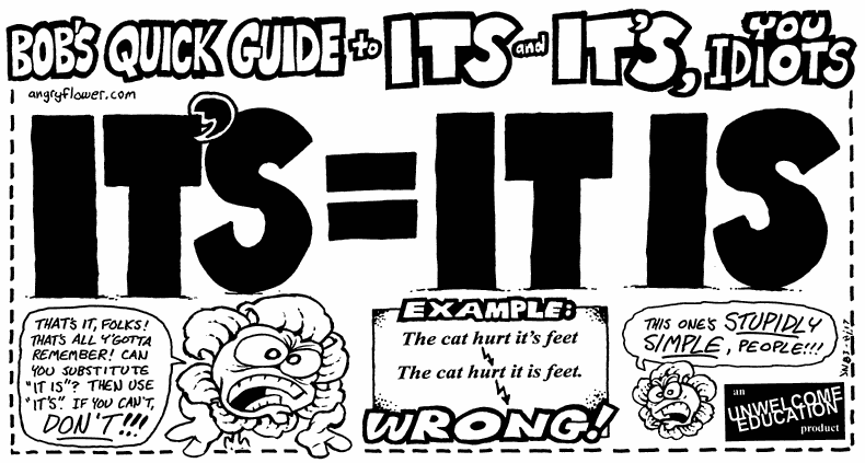
Bob's Quick Guide to Its and It's, you idiots

[via Meryl]
Dispelling myths about spam

Rebecca Lieb has an excellent piece at Clickz called The 10 Biggest Spam Myths. If you think "something must be done," then you should read this very informative and eye-opening article.

"Everyone battling the spam scourge -- marketers, consumers, lawmakers, and the media -- could do with a little reason and rationality just about now. It's time to think critically about received ideas on spam."

November 17, 2003

UIs aren't DIY

Sound & Video Contractor magazine (surprisingly enough) has a nice succinct article on why you shouldn't think of user interfaces as DIY (do-it-yourself).

"The same now holds true for user interfaces. When designing products or services for your customers, don't entrust the task of user interface design to amateurs. Whether you choose to use in-house personnel or consultants, make sure you use someone with experience in designing user interfaces — someone who knows how to find usability problems.

"Why risk alienating a customer because of a poorly designed interface? Many people have heard the buzzword intuitive applied to user interfaces. Make sure the interface is intuitive to the customer who has never used, or has little experience with, your product or service, not the person who just spent the past 24 months developing it."


Read the full article:Don't Try This at Home

November 13, 2003

Toys R Us and Sexual Assault of Children - Advertisers need to consider content that will surround their ads

I was just reading a current news item on the ABCNews web site (found via Google News headlines) and saw something that advertisers should be aware of when placing ads.

First, a little background: the news story is about how three suspects in a sexual assault case will not be tried as adults, even though the crime they are accused of is quite serious and the accused are all between 16 and 17 years old. Two of the alleged victims are 14 and 13 years old.

This story is being talked about quite a bit here in the states since many suspects in this age group are often charged as adults, but these suspects will be treated as juveniles in the court system. Victims' family members said the judge's ruling Wednesday to treat them as juveniles apparently means the three accused boys will get nothing more than probation and therapy

The ABCNews.com story goes into some details of the accusations over a three-page article on their web site. The first page provides some details of the alleged assault:

"the suspects could have faced 26 felony counts in the incident, in which two 16-year-olds and one 17-year-old allegedly sodomized the younger boys with a broomstick, pine cones and golf balls."

The first page ends just a few paragraphs from this rather graphic explanation. At the top of the second page, there is an in-page ad that you have to view and scroll past to continue reading. In this case, it was an ad for Toys R Us offering their latest catalog, so in big bold letters, the ad offers you "The Big Toy Book". This ad was rather shocking to me as a reader. Here, I'm reading a disturbing piece about young boys allegedly being cruelly sexually assaulted, and then I get a nice big cheery offer for a "big toy book." What are the brand implications for Toys R Us? Did their marketing department really want to associate their brand with sex crimes involving children? I'm sure not.

Tip for advertisers: don't buy advertising on news sites where your brand may be placed next to things with bad connotations. I recall when the movie "Schindler's List" was broadcast on television here in the states. The entire broadcast was sponsored by Ford and, as I recall, the advertising was very solemn and respectful of the content of the movie. It wasn't a time for a fun "Zoom Zoom" style of advertising. It wasn't a case where commercial interruptions of any sort would work - so the broadcast was uninterrupted.

Generally, advertisers should look at solutions like Google's AdSense that contextualizes advertising to the content. But more importantly, they can't look just at a web site's "reach", but must also look at the context in which their ad will be viewed. Advertisers need to consider the brand experience. ABCNews.com may attract the right demographics that Toys R Us was trying to reach, but I'm sure they never wanted their brand or their "Big Toy Book" associated with sodomy or the sexual assault of children.

Placing ads in the midst of content forces a reader to try and associate the ad with what they are reading. Ads should therefore not be place in the middle of content. Ads are almost always separate in content and purpose, and therefore should be kept in a separate "chunk" in the page layout.

As far as I know, Toys R Us is a great company. I shop there all the time. They sell great toys (like this cool mega-sphere). But they need to talk to ABC about where their ads are running if they're going to continue advertising with ABCNews.com.

November 12, 2003

The Bad Internet Fairy can teach you a lesson

Nick Usborne writes about A Fairy, a Low-Fat Bagel, and a Sack of Hammers in A List Apart. This is a great article about what we have to remember is of primary importance as web designers.

Usborne is the author of Net Words:


November 11, 2003

Free Web Content

Tired of using "greeked" or "latin" text like "lorem ipsum" on page mockups? Try ungreek.

[Via Meryl]
Study says brain hard-wired for empathy

This may explain why video highlights of usability testing are more convincing than a report...

"Ever watched someone grimace after they sniffed a carton of sour milk? Even though you were spared a whiff of stinky milk, to your brain, you might as well have been sniffing the milk yourself, a report from Italy suggests. New research shows that when we see an expression of disgust on someone else's face, the same part of our brain -- the insula -- is activated as when we feel disgust ourselves.

'People have overemphasized the importance of thoughts in our understanding of others,' Dr. Christian Keysers of the University of Parma, a co-author of the report, told Reuters Health. Although Keysers said that empathy for others is often thought of as a matter of morals, 'in our study, on the other hand, we show that empathy is a very basic, simple and automatic process,' he said. Keysers explained that when we see the emotions on another's face, 'we don't need to think about how that person feels.' Instead, according to Keysers, we share the feeling of disgust because the insula is activated as if we were disgusted ourselves.

'This sharing is automatic,' he said. 'Our subjects were not asked to share the emotion of the other person and did not report attempting to do so after the scan. It just happens.' Keysers continued, 'This shared feeling of disgust could then be our key to understanding how the other person feels.'"


From Reuters Health Information: Brain hard-wired for empathy: study
Spam for Christmas?

BBC NEWS: Spam set to soar this Christmas:

"Spam filtering and security firm FrontBridge said that now more than 70% of the mail it filters is spam based. This is a rise of almost 50% since the start of 2003. FrontBridge said that now the average company with 1,000 employees sees more than 2.1m spam messages per year."

Somebody could make a lot of money if they figured out a better way to fight Spam.
A new metric - restarts

"I discovered an interesting metric to collect for a usability evaluation of a site - restarts - the number of times the participant 'starts again' when trying to find information."

More: DonnaM: A new metric - restarts:

November 07, 2003

Wheel Mouse + Drop-downs = Gotcha! for Ecommerce Sites and Web Form Users

The lesson: new user input devices can create new interaction issues... The Devil’s in the Details

So, trying to scroll toward the submit button, you have actually changed your credit card expiry from 2004 to 2009, before you realize the wheelie isn’t scrolling the page. Furrowing your brow, focused on the fact the wheel isn’t doing what it’s supposed to be doing – and completely unaware you’ve entered a new expiry – you click your mouse (the technological equivalent of kicking your car’s tires), thereby locking in your new selection – and continue with the process. You submit the order ... The next thing you know, you’ve got one of those emails that I got (hopefully a nice one). “Your credit card was declined.”

I've personally experienced this problem. This would be a great interaction issue for someone to research. (Hint, hint, folks at SURL...)

November 06, 2003

Wanna Dance?

This has evidently been around for some time, but I can't recall seeing it before. The Dancing Jakob Nielsen (note it requires sound for the best experience).

Apologies to Jakob.

Note to self #1: think twice before putting "action photos" on web site.

Note to self #2: you'll know you've got people's attention when they take the time to create parodies poking fun at you.

November 03, 2003

UI Development Roles

Bob Owen has a nice (albeit slightly mis-titled) breakdown of "Roles in the Development of User Interface Software" on his site. (Mistitled because I think it's a description of roles in development of software user interfaces.)

"This document describes the five major user interface software development roles Ethnographer, Interaction Designer, Graphic Artist, User Interface Programmer and Usability Tester. Also discussed are the type of work products produced, typical background for each role and a simple user interface software development process."

Compare and contrast with:
- Challis Hodge: Experience Design Relationship Model from Models, Diagrams & Theories

- AIGA-ED Presentation: Role: Usability Specialist, presented by Steve Krug and some other sharp folks

- Step Two: Roles needed in an intranet team

October 31, 2003

OK/Cancel: A Comic Strip for Me

"OK/Cancel is a comic strip written for a very specific audience, but much of what we talk about is quite universal. Most everybody can relate to things in the world which don't work like they should -- and you needn't be a usability specialist, interaction designer, industrial designer or any sort of designer to appreciate that frustration. But if you ARE any of those aforementioned people or have had the pleasure and pain of working with one or more of this rare breed, this strip is for you."

I like this particular strip.

[via UsabilityNews]